BLOOMINGTON, IN — People purchase the structures they call home for a variety of different reasons. For these homeowners, the wife has fond memories of visiting this 1959 mid-century modern residence as a child growing up in Bloomington, IN, when her mother’s best friend was its caretaker.
“She grew up going to this house,” says Susan Yeley, creative director/owner of Susan Yeley Homes in Bloomington. “After ‘Bloomeranging’ back to Bloomington, she and her husband purchased it so they could breathe new life into it for their family.
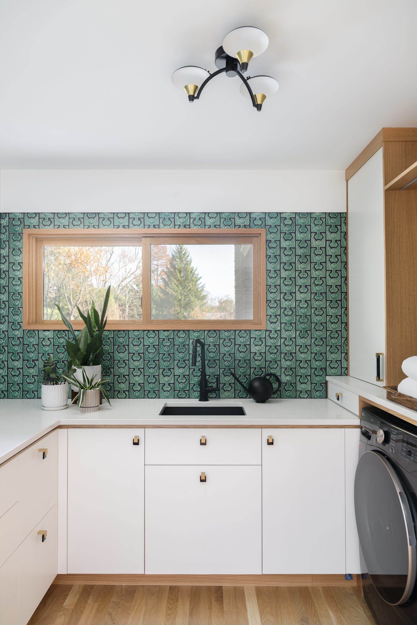
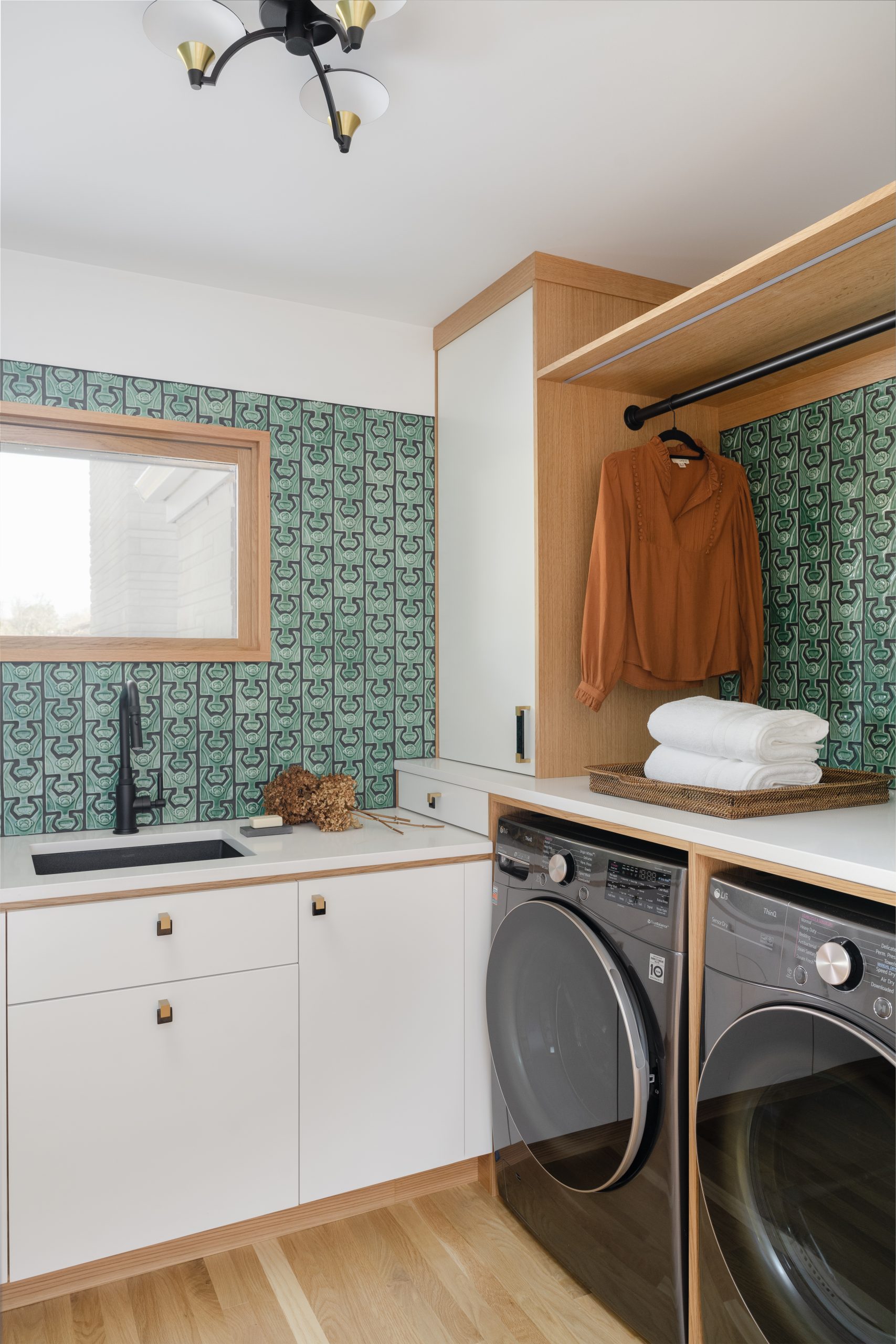
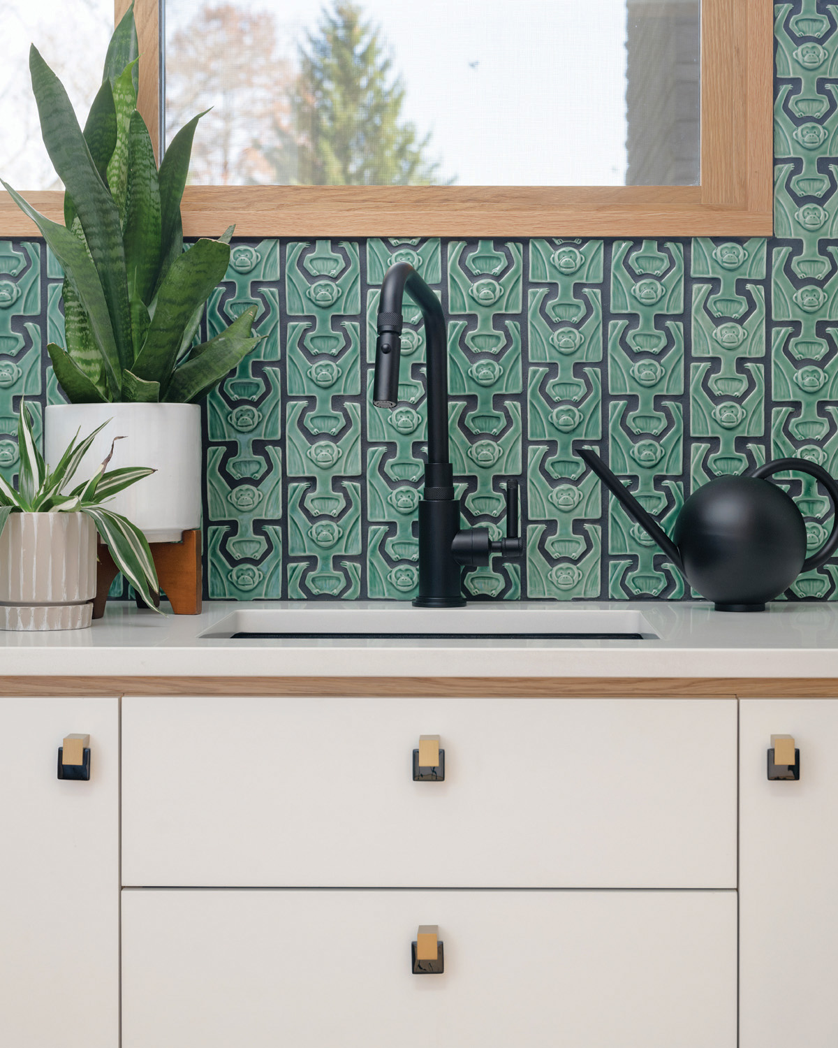
“They were great to work with, too,” she continues. “I refer to them as ‘unicorn’ clients because this was such a happy project…in every possible way. My clients were fun and trusting. They have great taste themselves, yet they were completely open to our suggestions. It was a great process. We had a lot of minds coming up with ideas and thoughts…reinforcing each other and getting excited about things like the unique green monkey [shaped] tile that we used in the laundry room. They are vibrant, fun people to be around and we loved designing their home. And, since we also do decorating, we were able to curate furnishings, art and accessories to fill it so nothing, neither windows and cabinetry nor art and furniture, was an afterthought.”
Over the course of about two years, starting in the middle of the pandemic, Yeley and her team transformed the home’s interior, including the kitchen and an addition, which became the new primary ensuite (see sidebar at the bottom), as well as the exterior. As an historic home, she wanted to be respectful of its iconic architectural heritage, yet honor the way her clients live in it today.
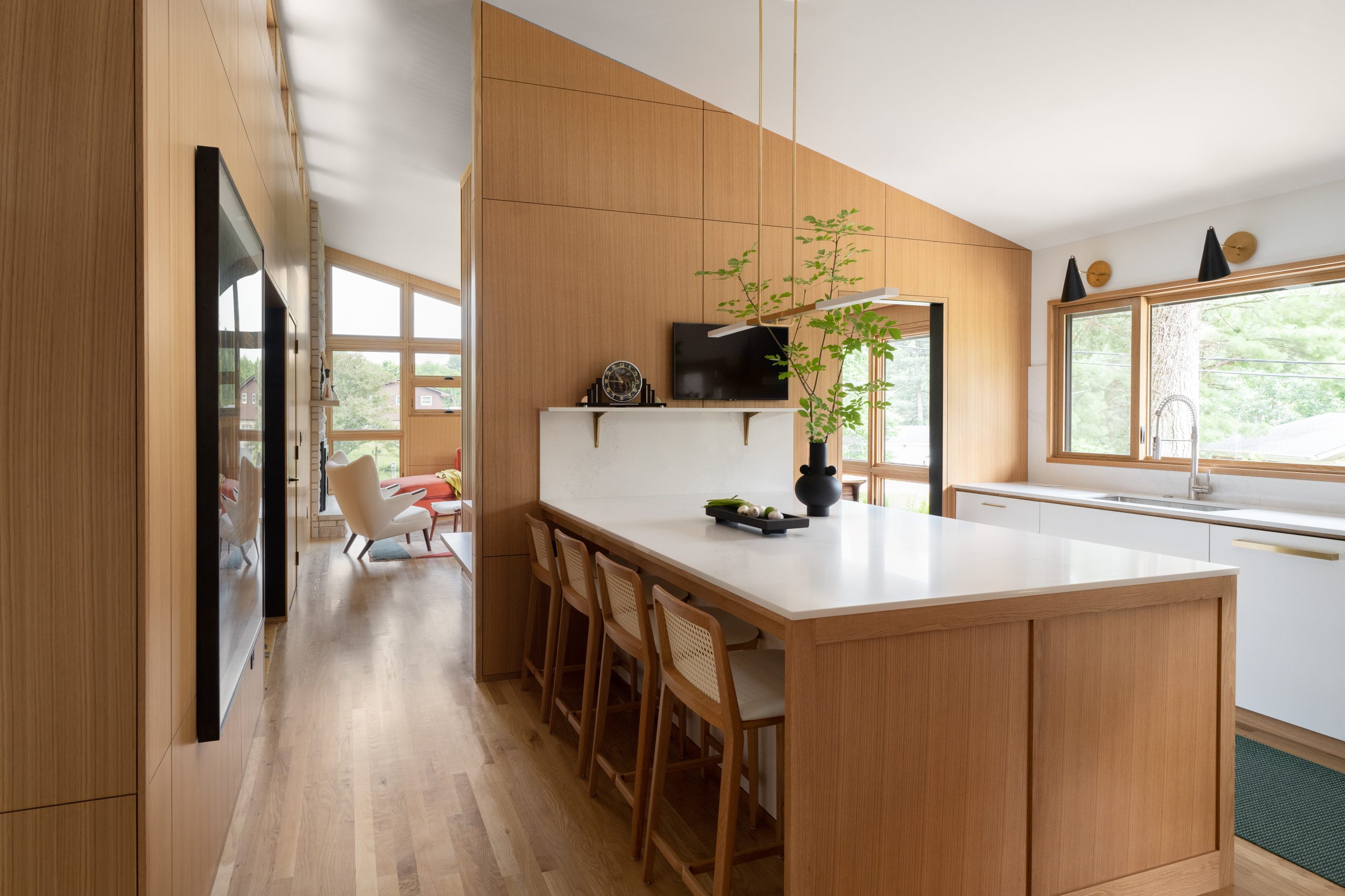
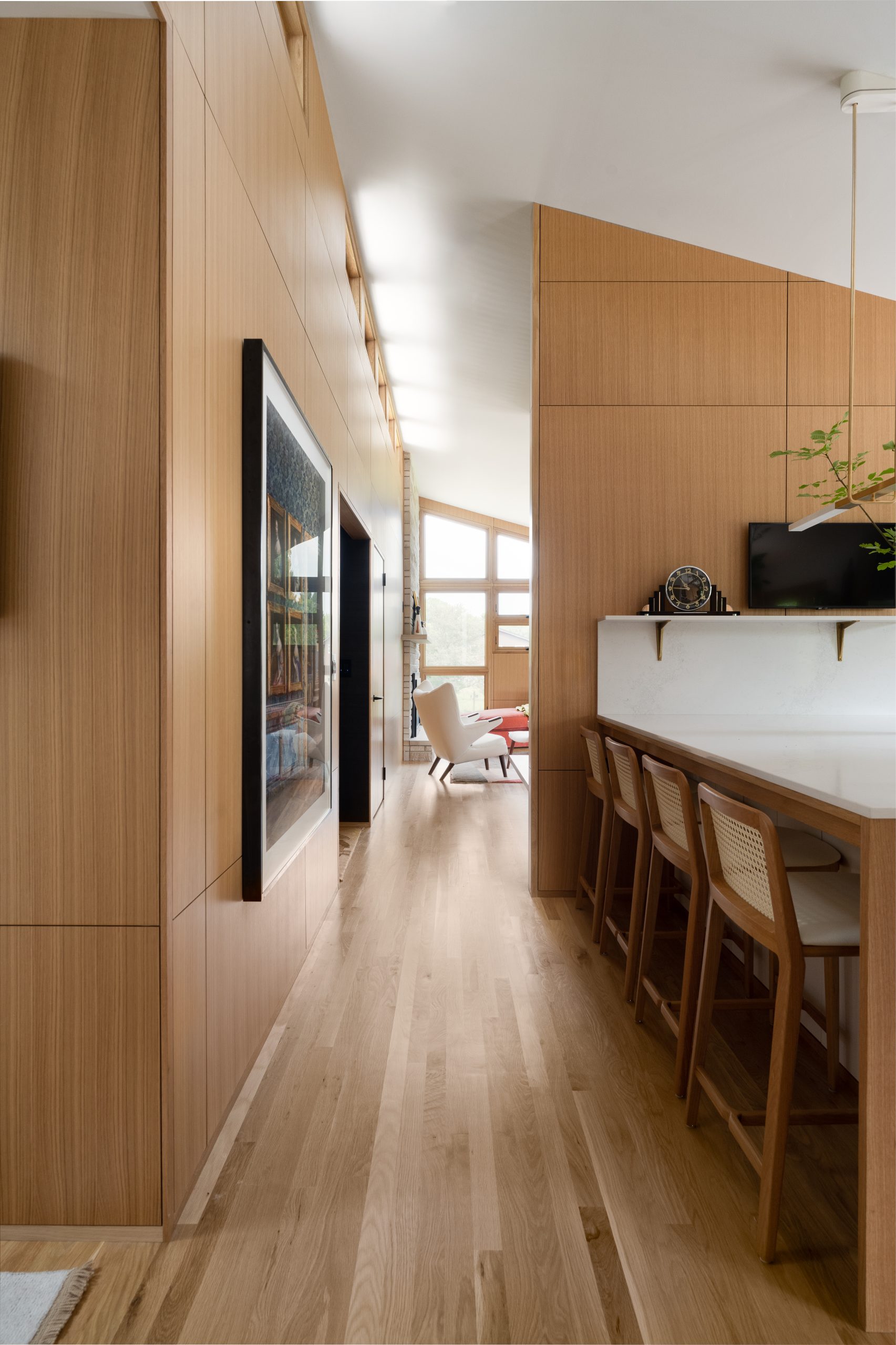
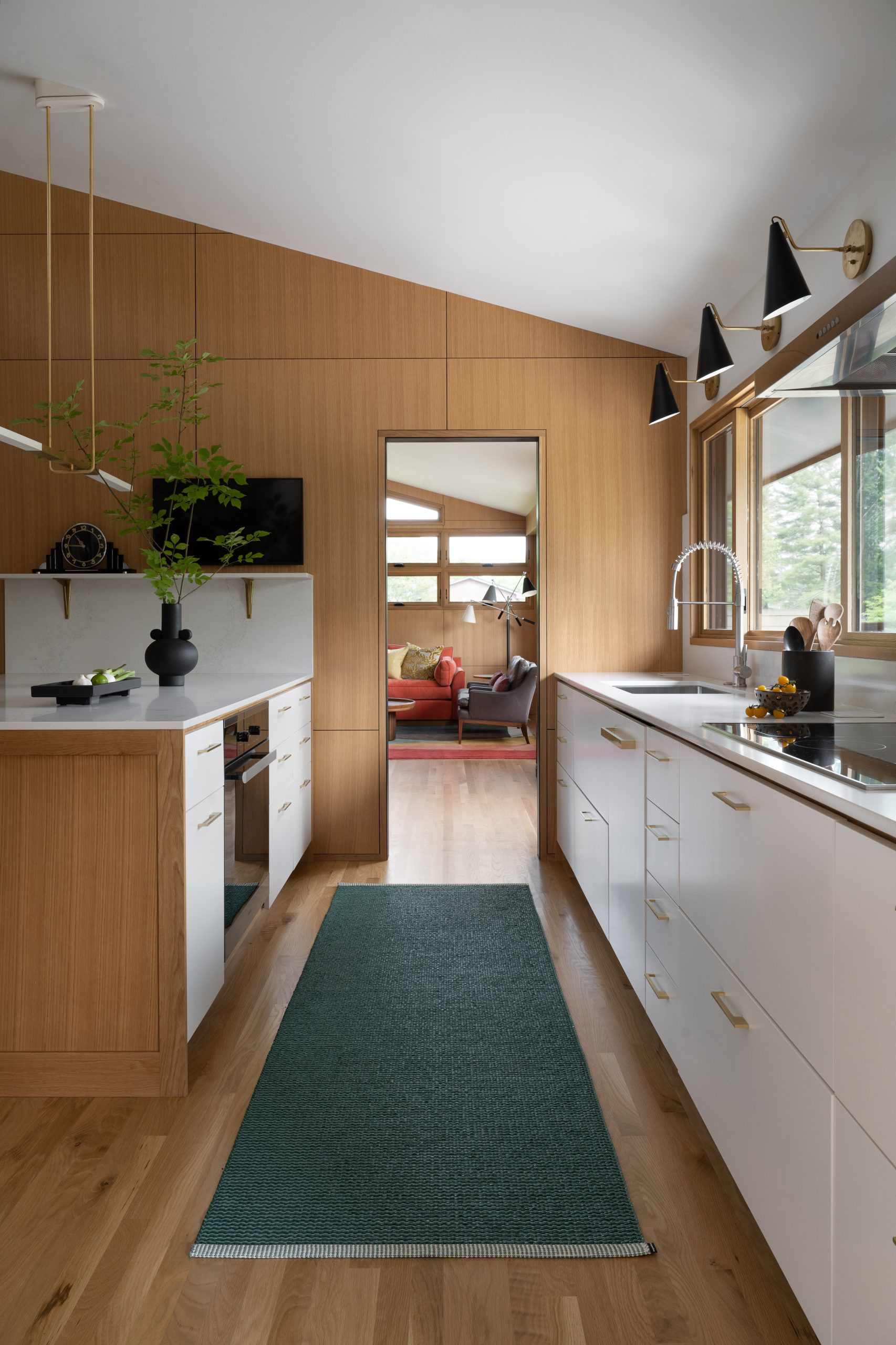
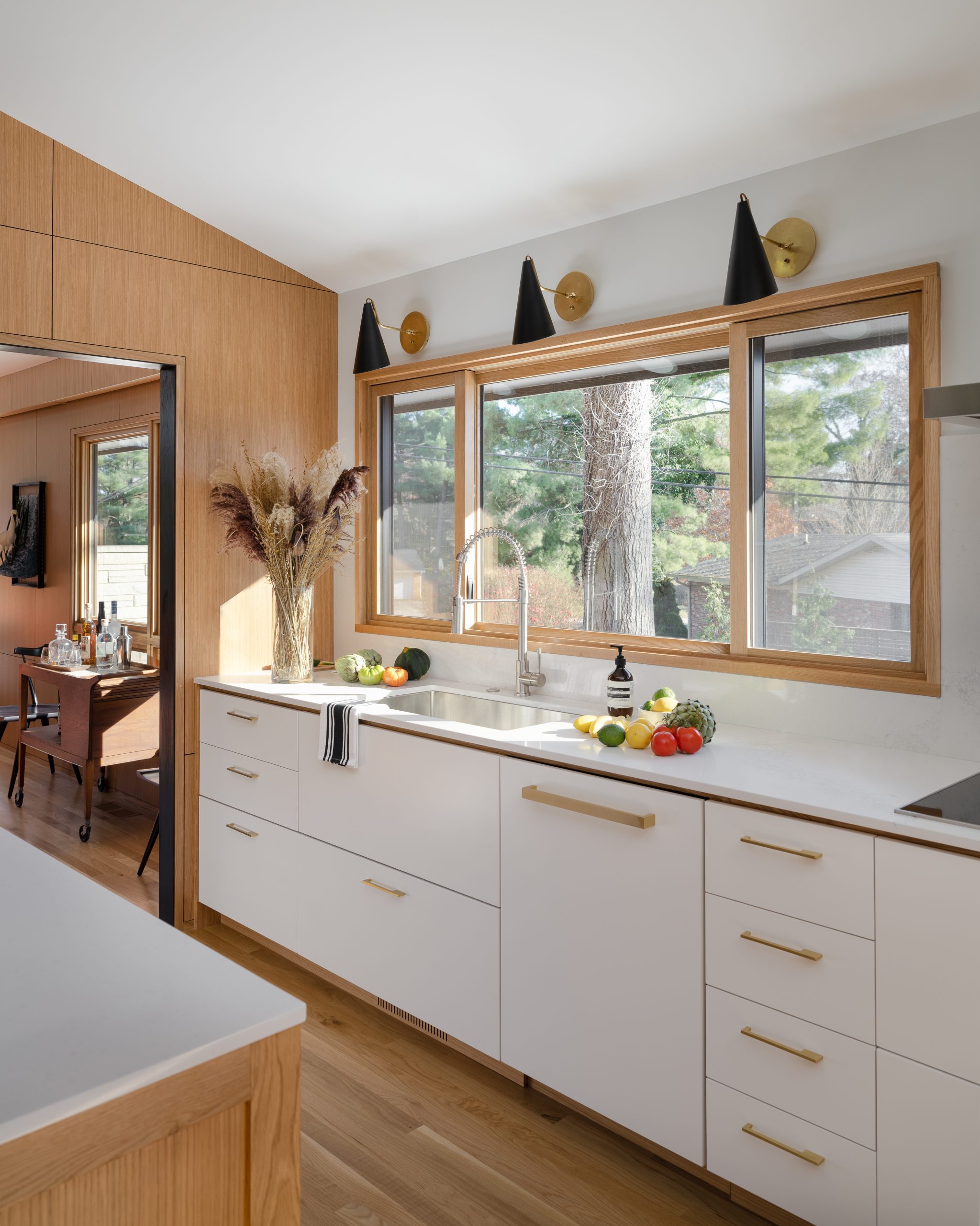
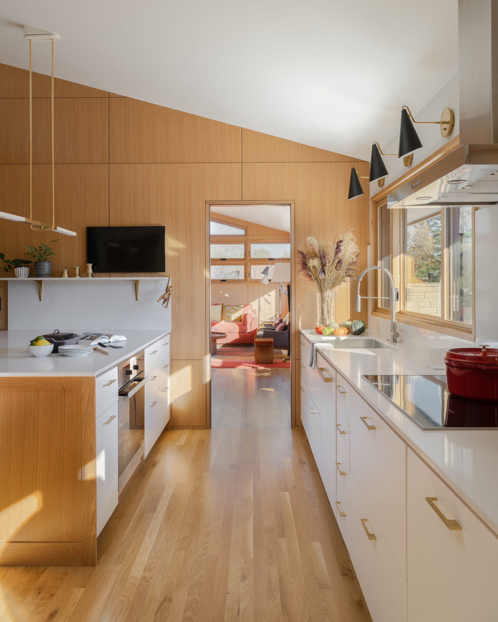
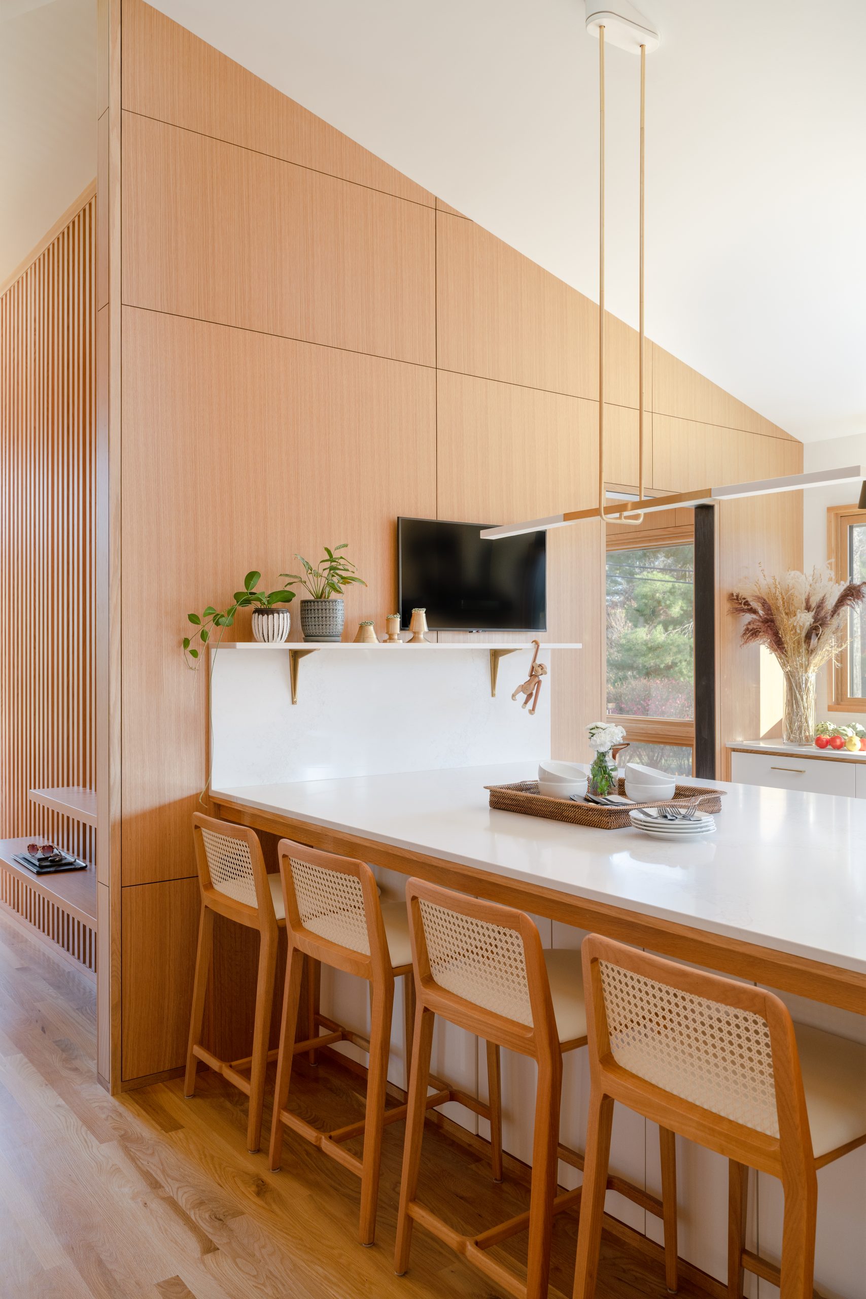
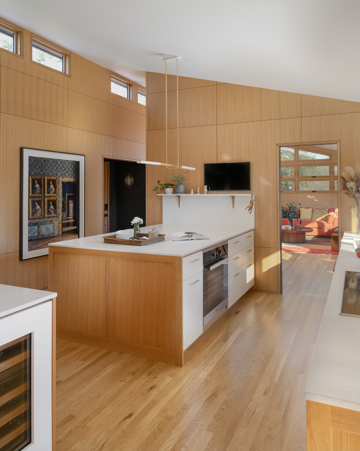
In that regard, they removed a wall that opened the kitchen into a former hallway, thereby also exposing some quintessential clerestory windows and creating a better connection to the adjacent dining and living spaces.
“It was typical of mid-century modern architecture to have the kitchen separated from the other rooms,” she explains. “There are purists who want to keep it that way, and sometimes a home’s architecture doesn’t uphold an open concept. But these clients didn’t want to live in a museum. They wanted to keep a sense of the original structure and its history, but not compromise contemporary living and more connectivity between spaces.”
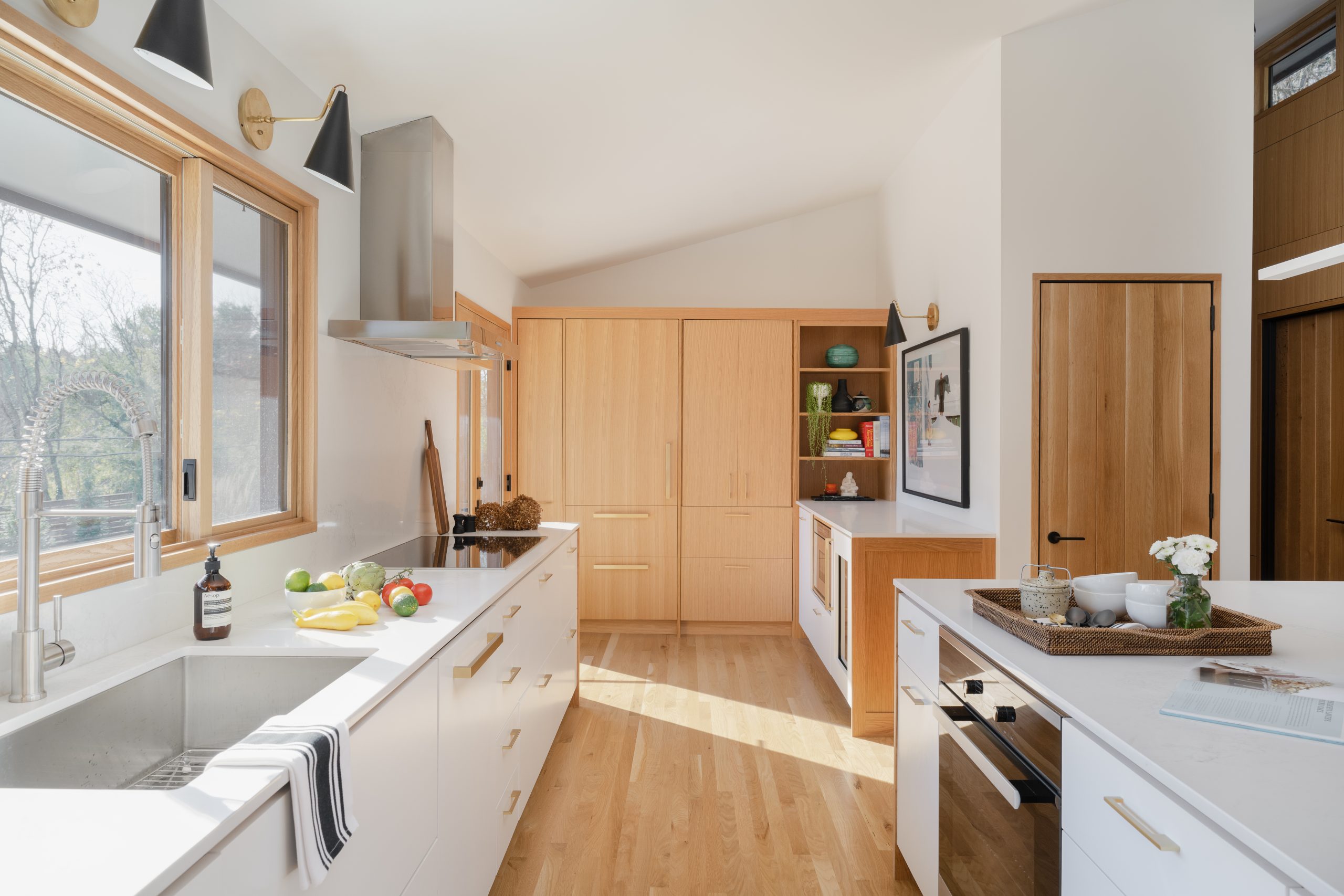
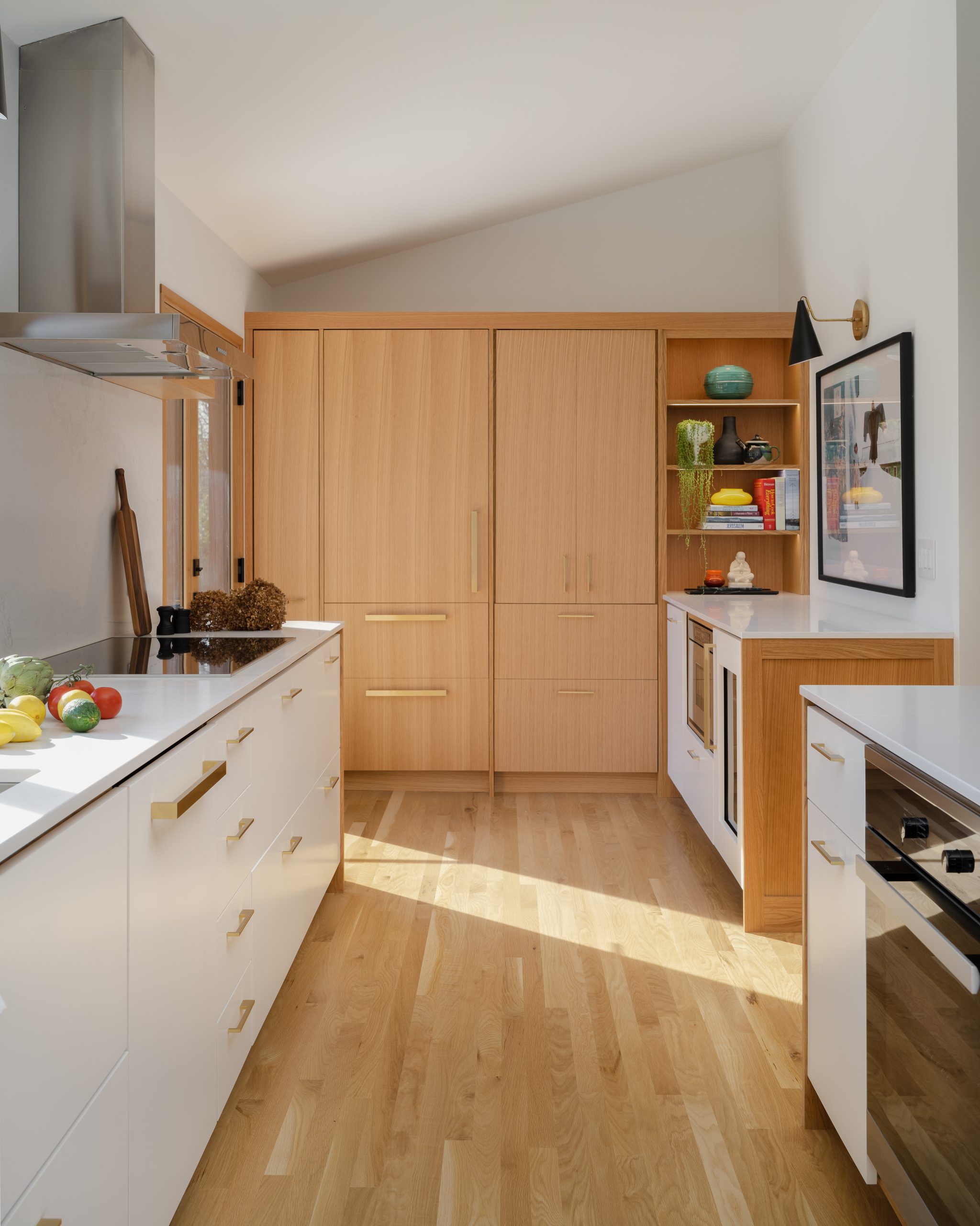
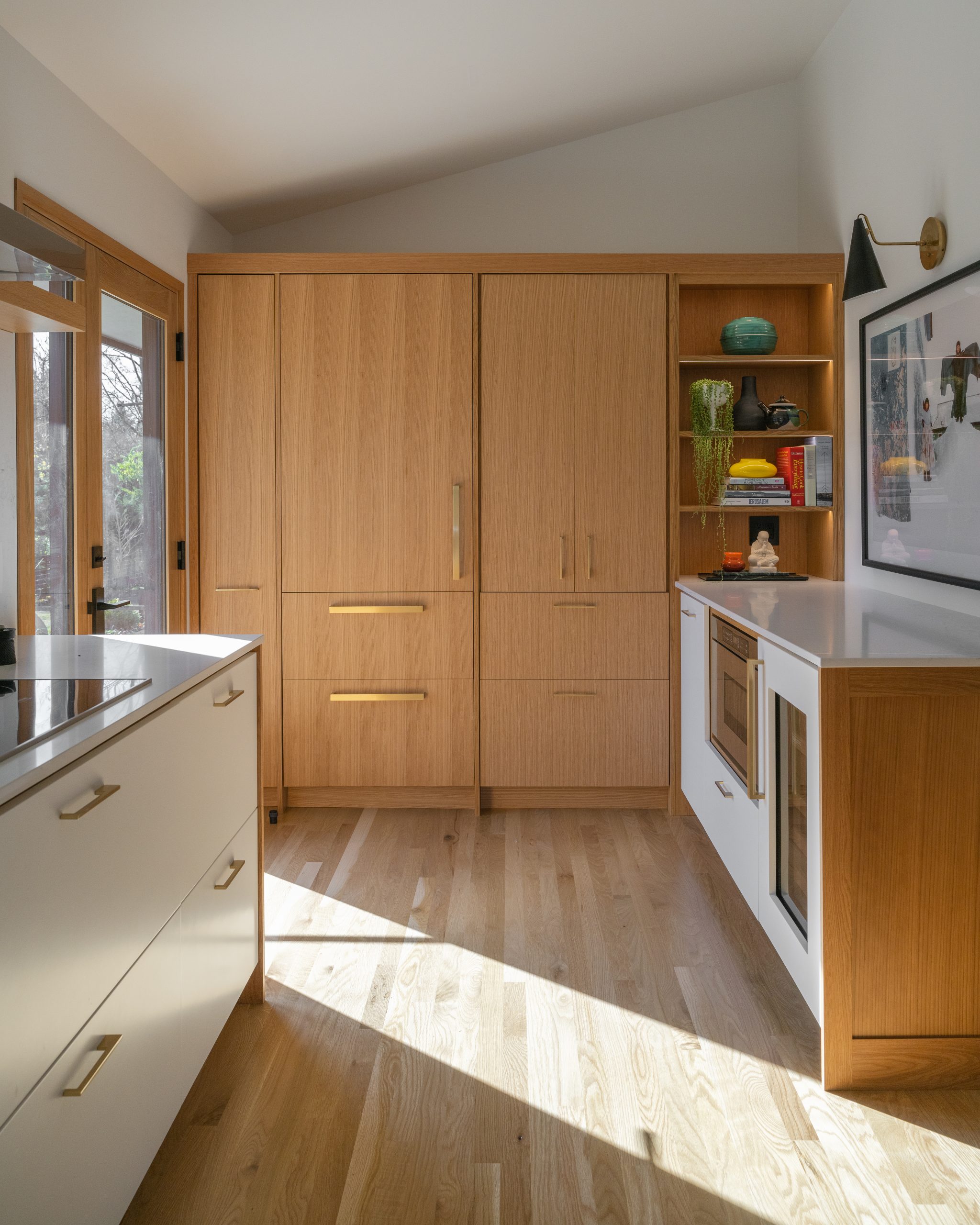
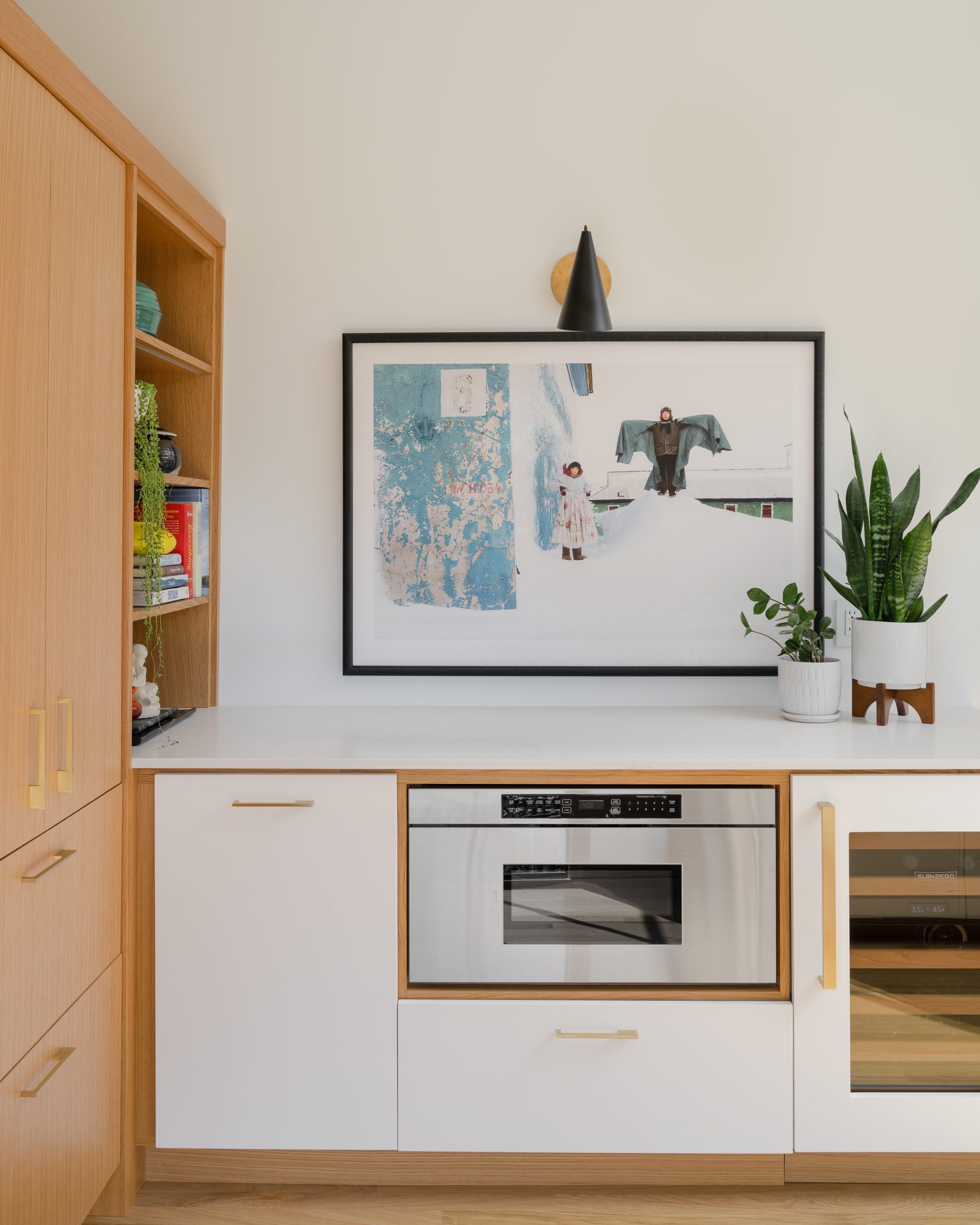
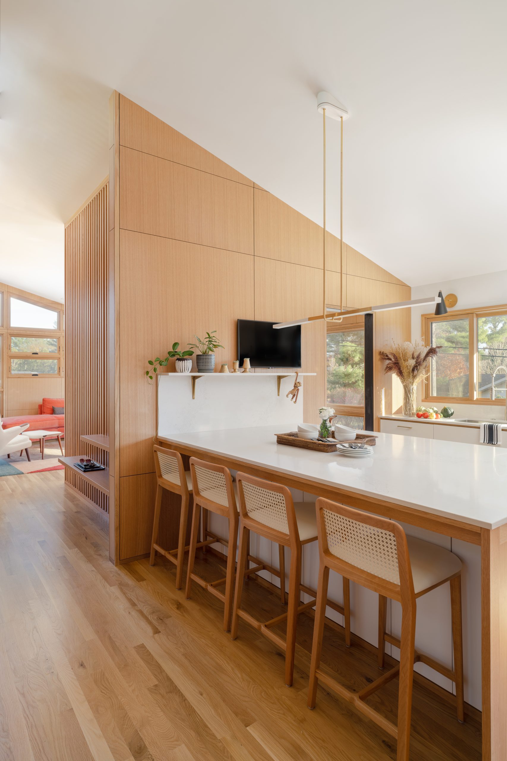
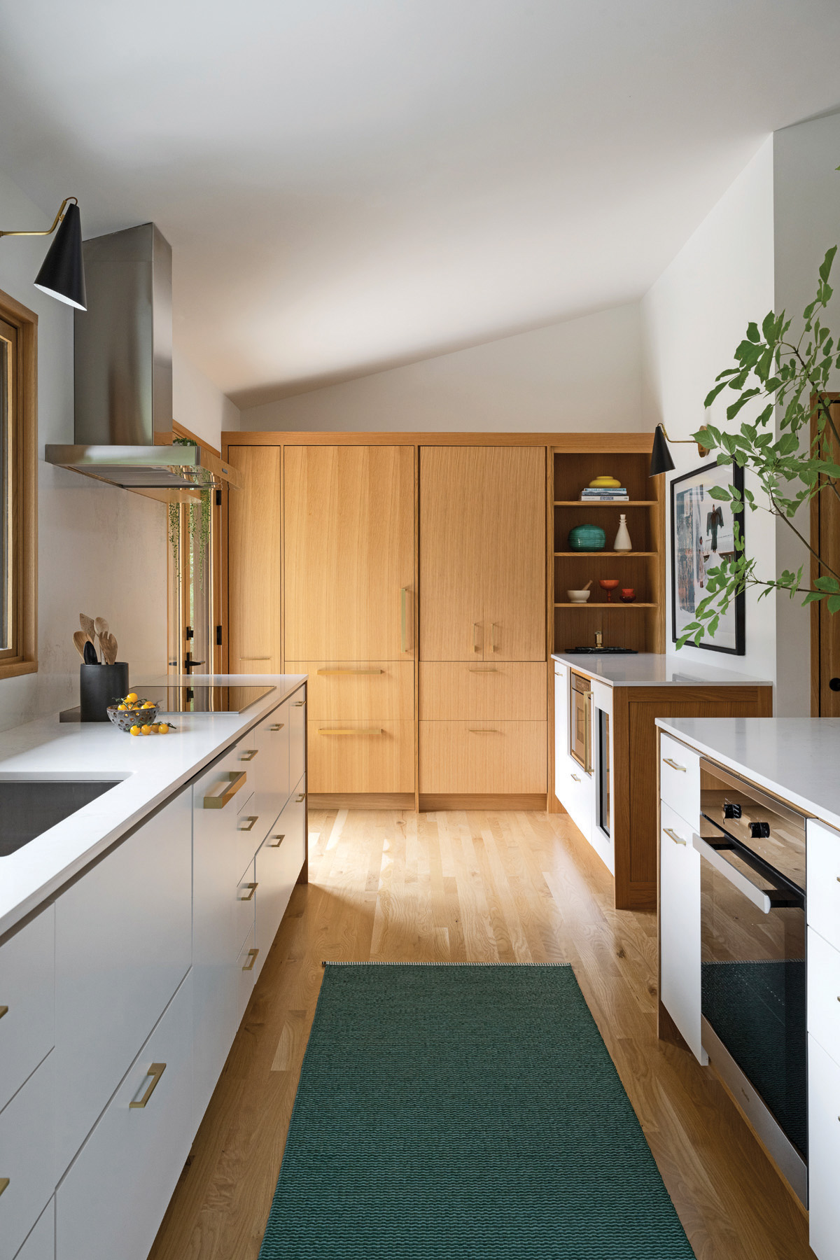
The wall’s removal also had the added benefit of increasing the kitchen’s relatively small footprint, as did the inclusion of a former breakfast nook, which is now home to a plethora of kitchen functions, including a pantry and coffee station for small appliances, refrigerator/freezer drawers, built-in open shelves with a pull-out corner base unit below, a microwave and a wine/beverage refrigerator.
“The kitchen, as well as the entire house, isn’t particularly large, so there wasn’t really any room for dead space,” Yeley indicates. “That wasn’t necessarily a bad thing, though, since it allowed us to make it a bit of a jewel box…to really lean into every square inch of space.”
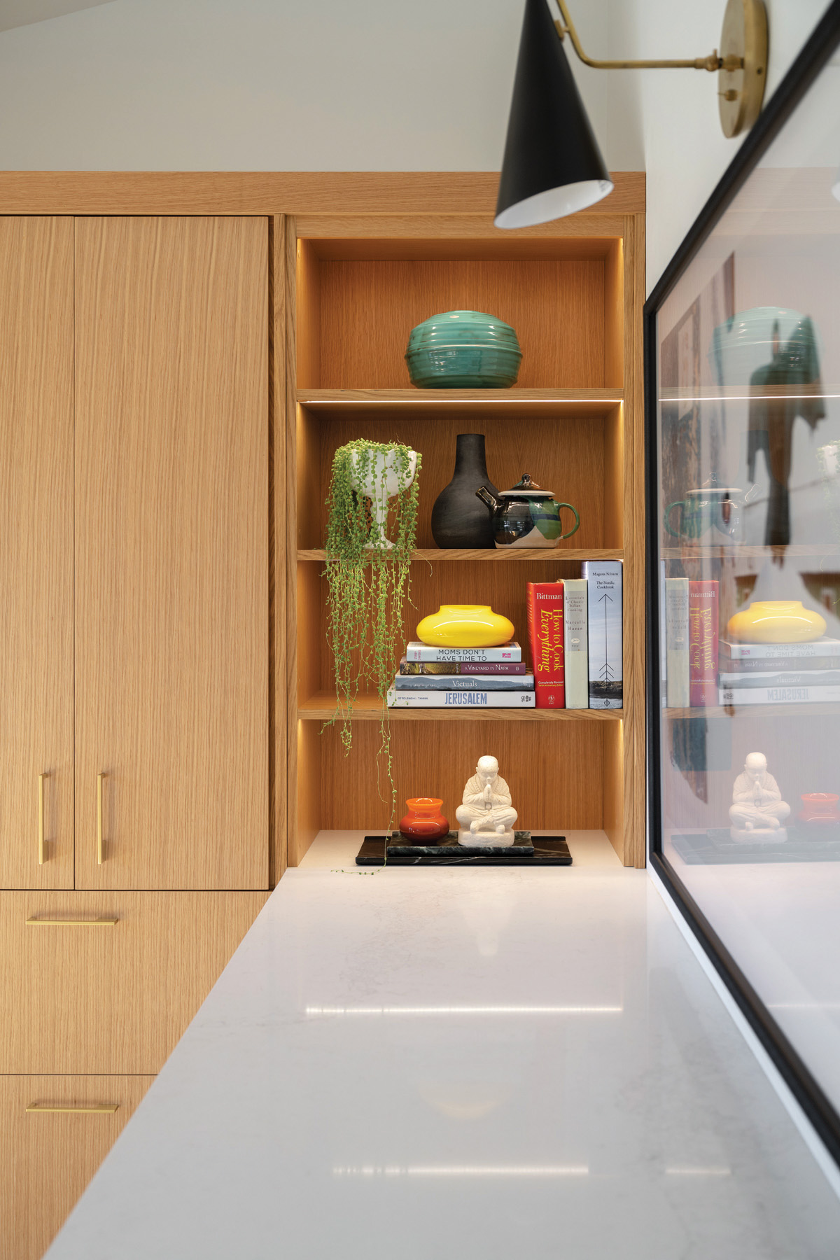
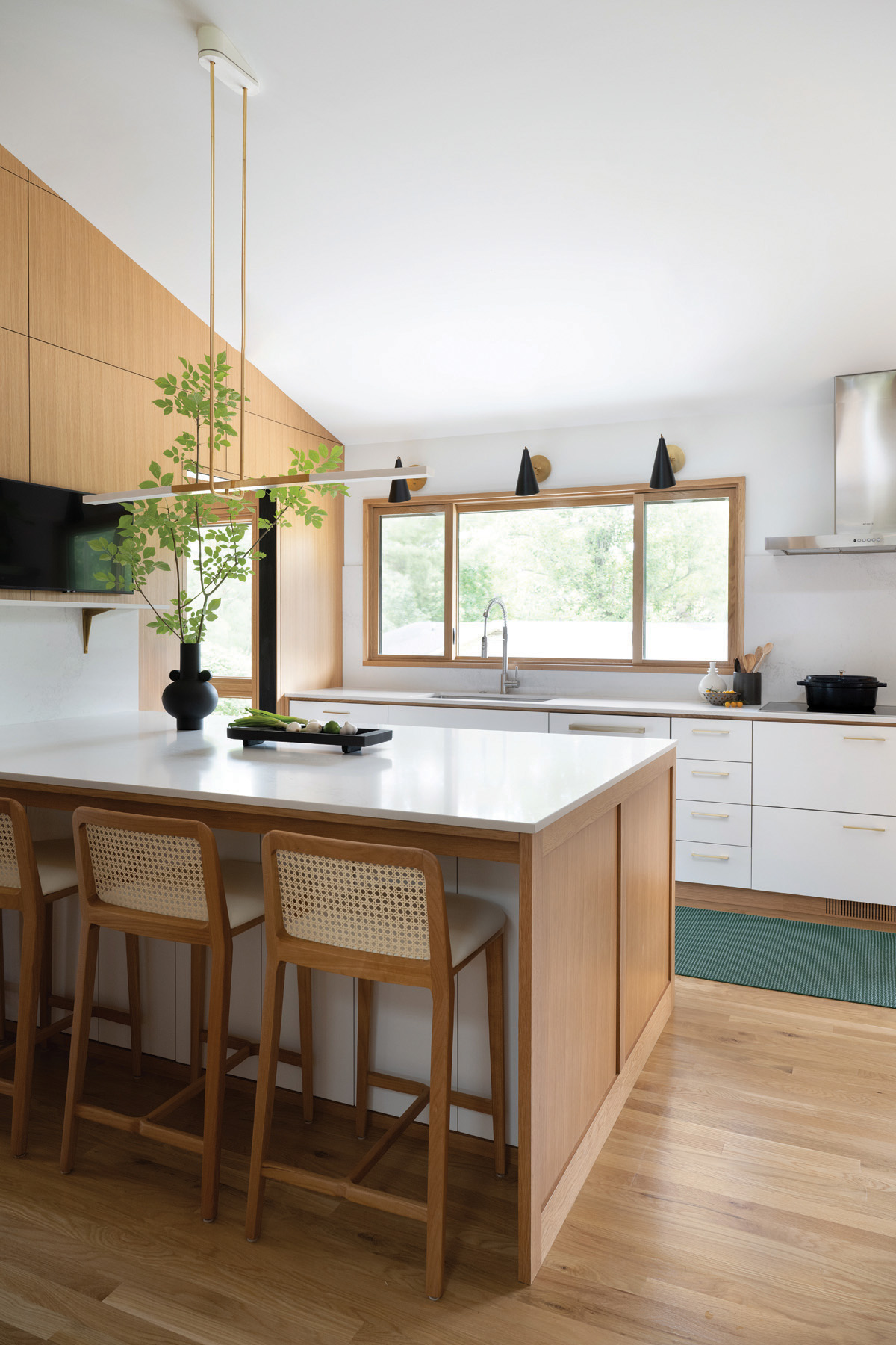
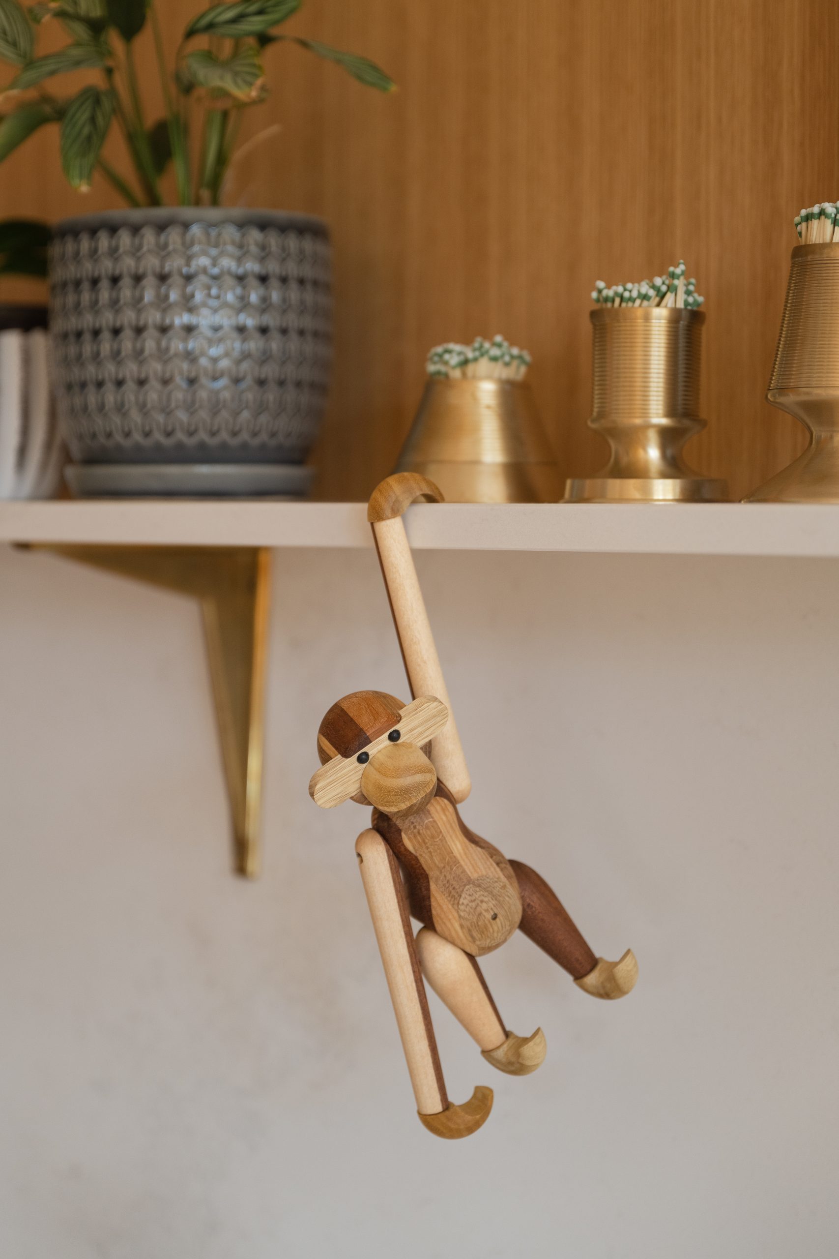
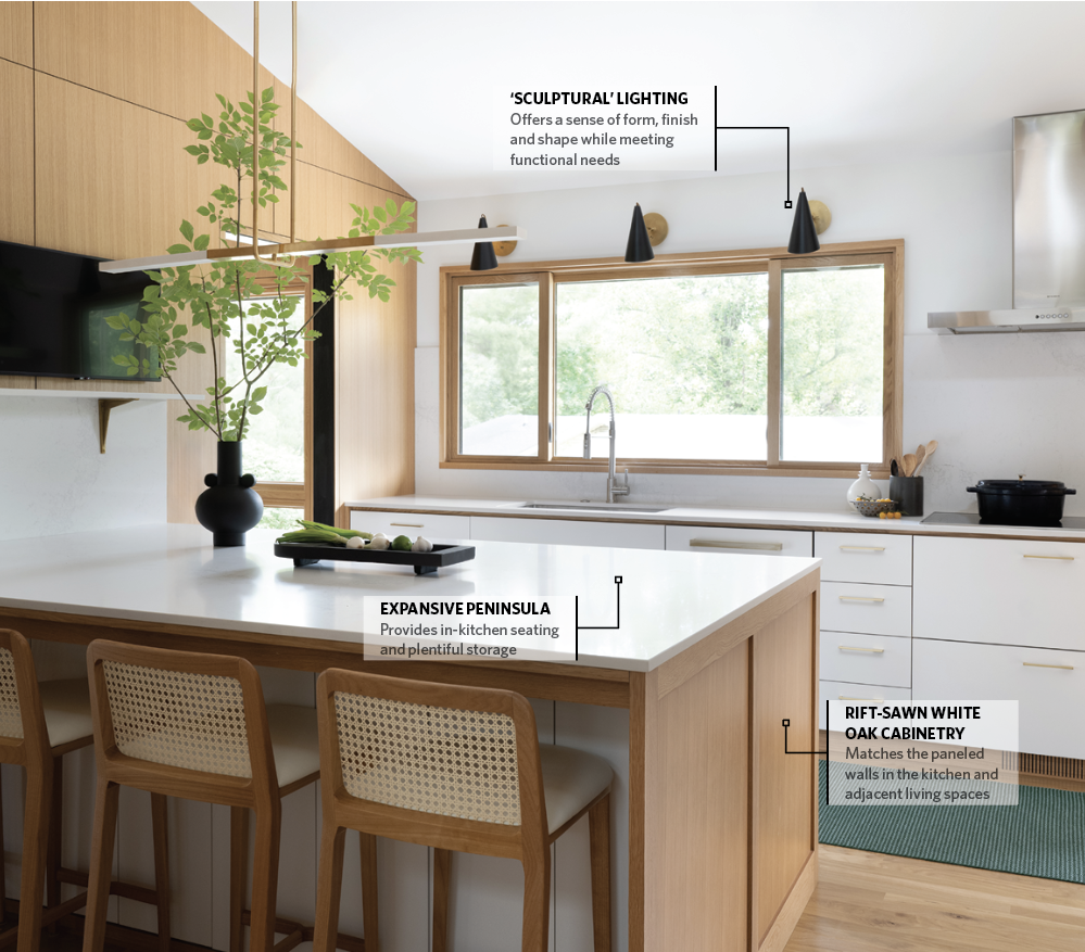
Expanding the footprint also gave the team the ability to include a large peninsula, which provides in-kitchen seating as well as storage and a pull-out trash/recycling bin. Since it is a peninsula rather than an island, they were able to continue the countertop up the wall, extending it into a shelf where the homeowners can display collectibles, such as the vintage German clock, mixed with contemporary conveniences such as the television.
“Everybody loves an island,” she relates. “I suppose we could have included one here, but we didn’t really need another passageway for traffic flow.”
Maintaining the Right Focus
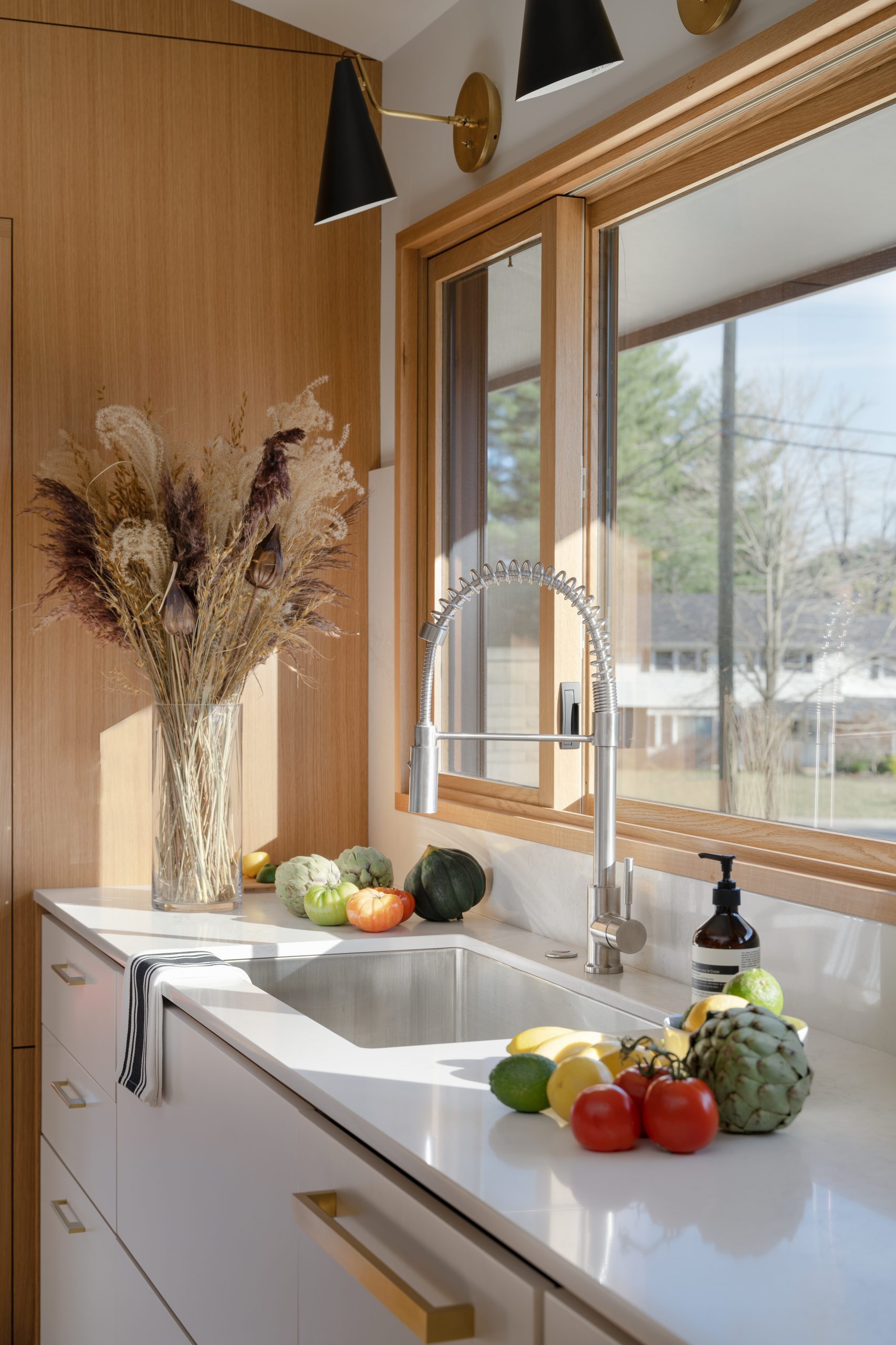
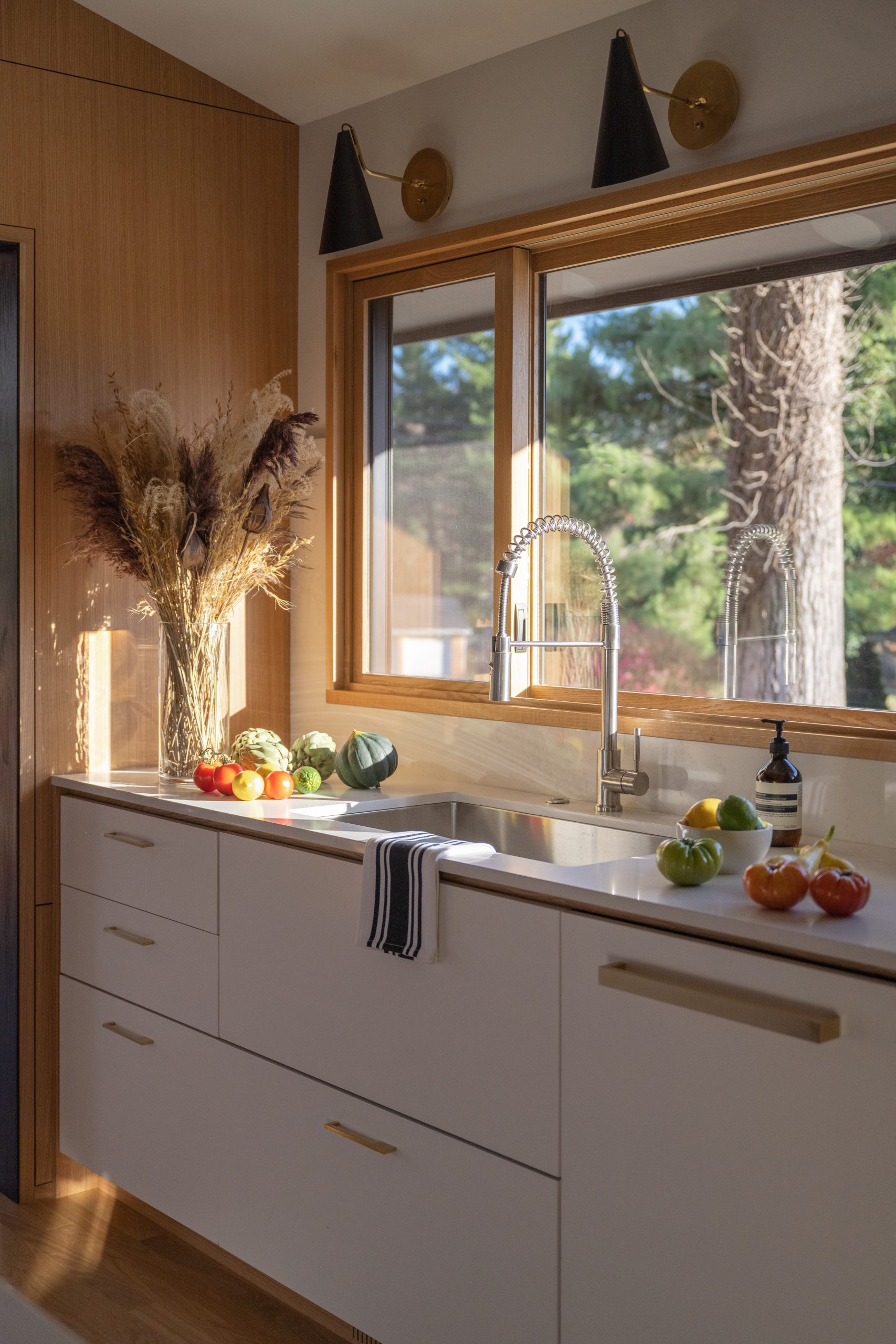
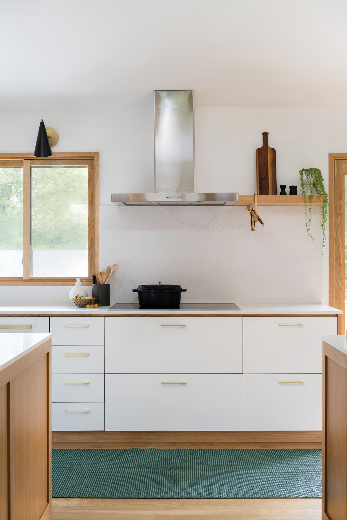
Since her clients like to cook and entertain, maximizing worktop surfaces and incorporating an abundance of appliances were important objectives. The former is addressed via Caesarstone Calacatta Nuvo quartz countertops, chosen for their durability and relatively ‘quiet’ aesthetic. Yeley also repeated the quartz as the backsplash behind the cooktop for a clean aesthetic that blends effortlessly with the walls and white cabinetry.
“This quartz allows the countertops to recede a little bit,” she explains. “People often want natural stone, which usually has a lot of veining that makes it a focal point in a room. In this kitchen, we wanted the focal points to be the clients’ beloved art pieces – they are collectors of contemporary photography and portraiture – and the home’s architecture.”
As for the appliances, several are paneled, including the Sub-Zero refrigerator and freezer drawers, the Sub-Zero wine/beverage refrigerator and the Miele dishwasher, which join the Miele oven and induction cooktop and the Dacor built-in microwave. Panels match either the white painted cabinetry or the rift-sawn white oak cabinetry, the latter of which also matches the paneled walls in the kitchen and adjacent living spaces.
The gold-tone Schoolhouse cabinetry pulls coordinate with the gold-tone lighting fixtures, including the custom light fixture above the peninsula and the Visual Comfort sconces above the window and Rohl sink.
“Lighting in a sloped ceiling, which we maintained from the original design, can be a little ‘wonky’,” she says, “so in addition to any general, ambient lighting in the ceiling, we paid special attention to task lighting with sconces and pendants that pull light down to where it is needed.
“Those ‘human-scale’ lighting fixtures, which include sconces and pendants as well as other fixtures like table and floor lamps, also achieve a mood and coziness, in addition to anything functional,” she continues. “They also provide a sculptural quality. When done right, there is a sense of form, finish and shape. Lighting actually works really hard in a space.”
Maintaining Cohesiveness
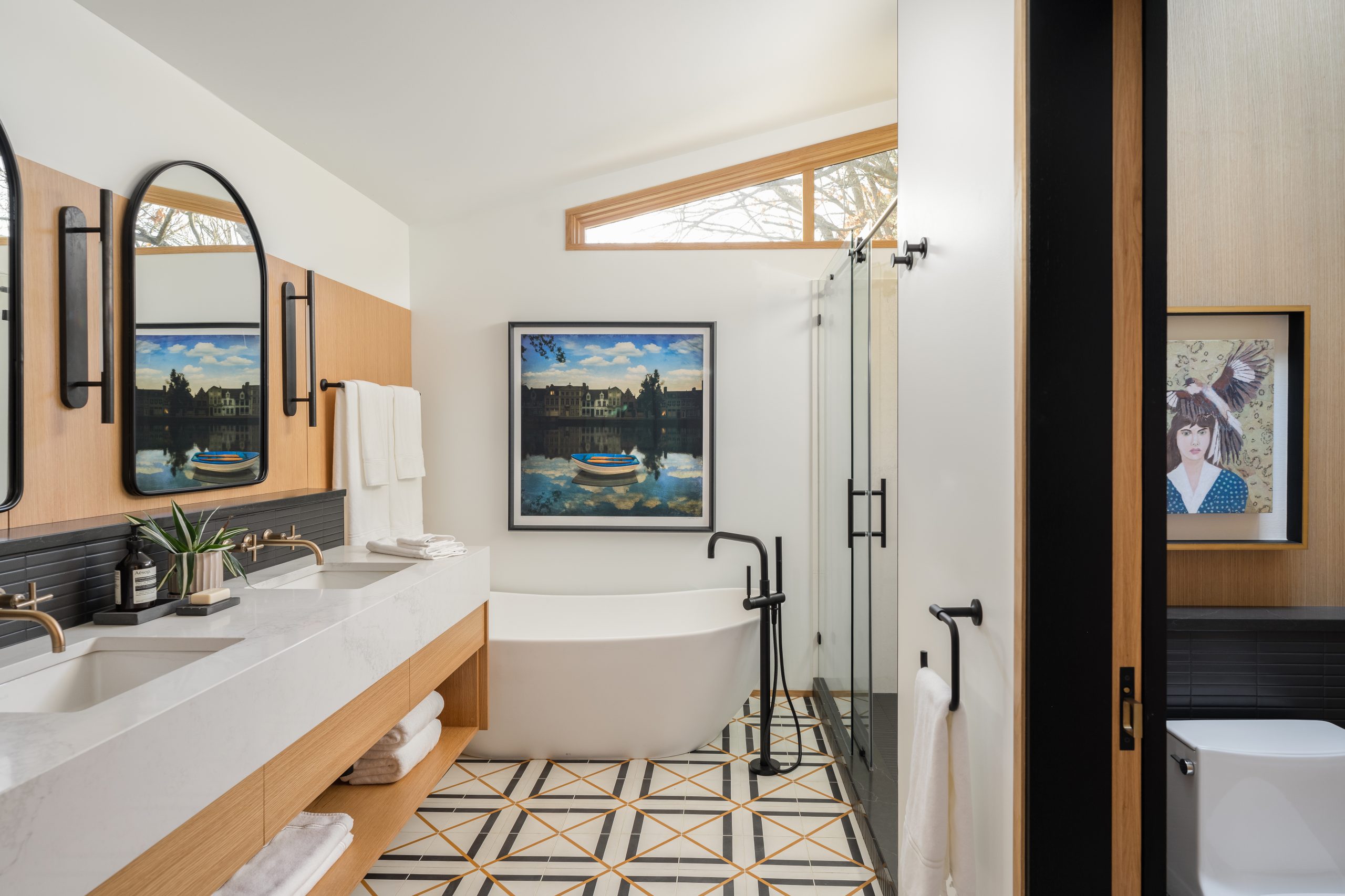
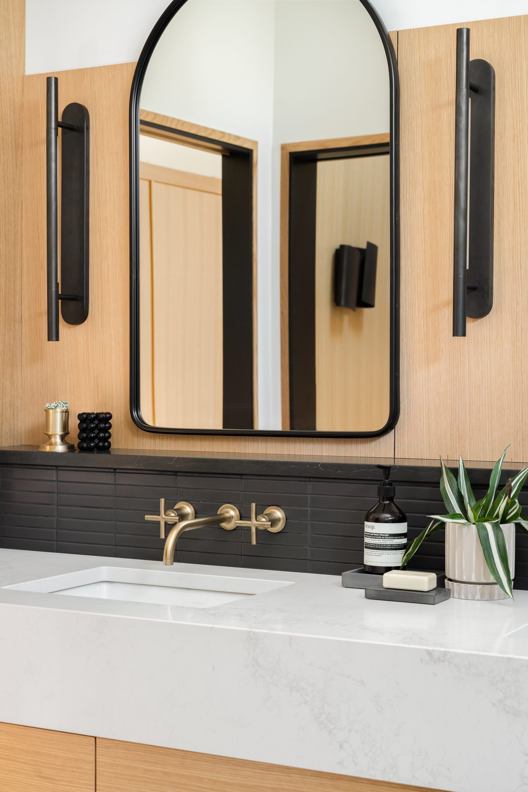
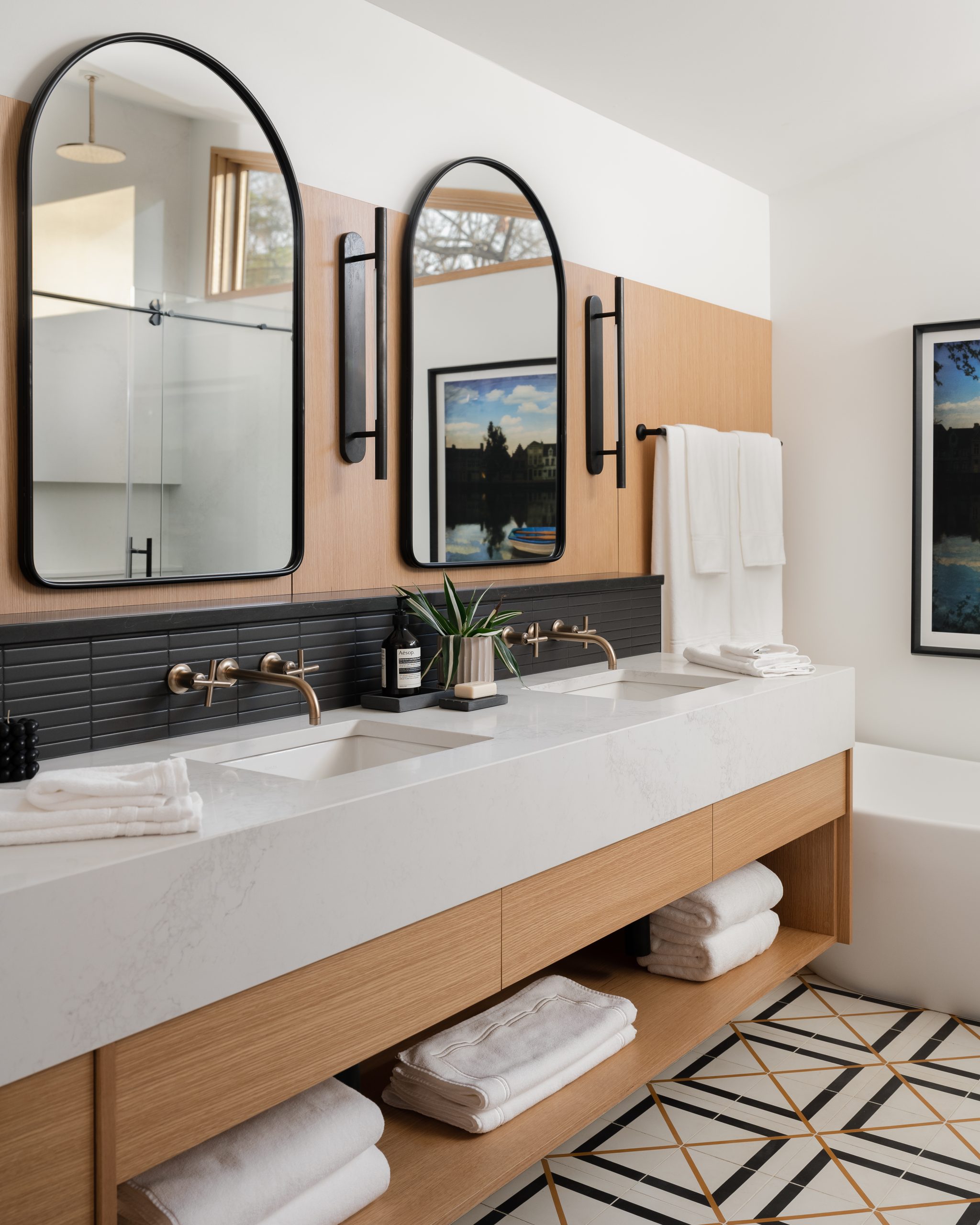
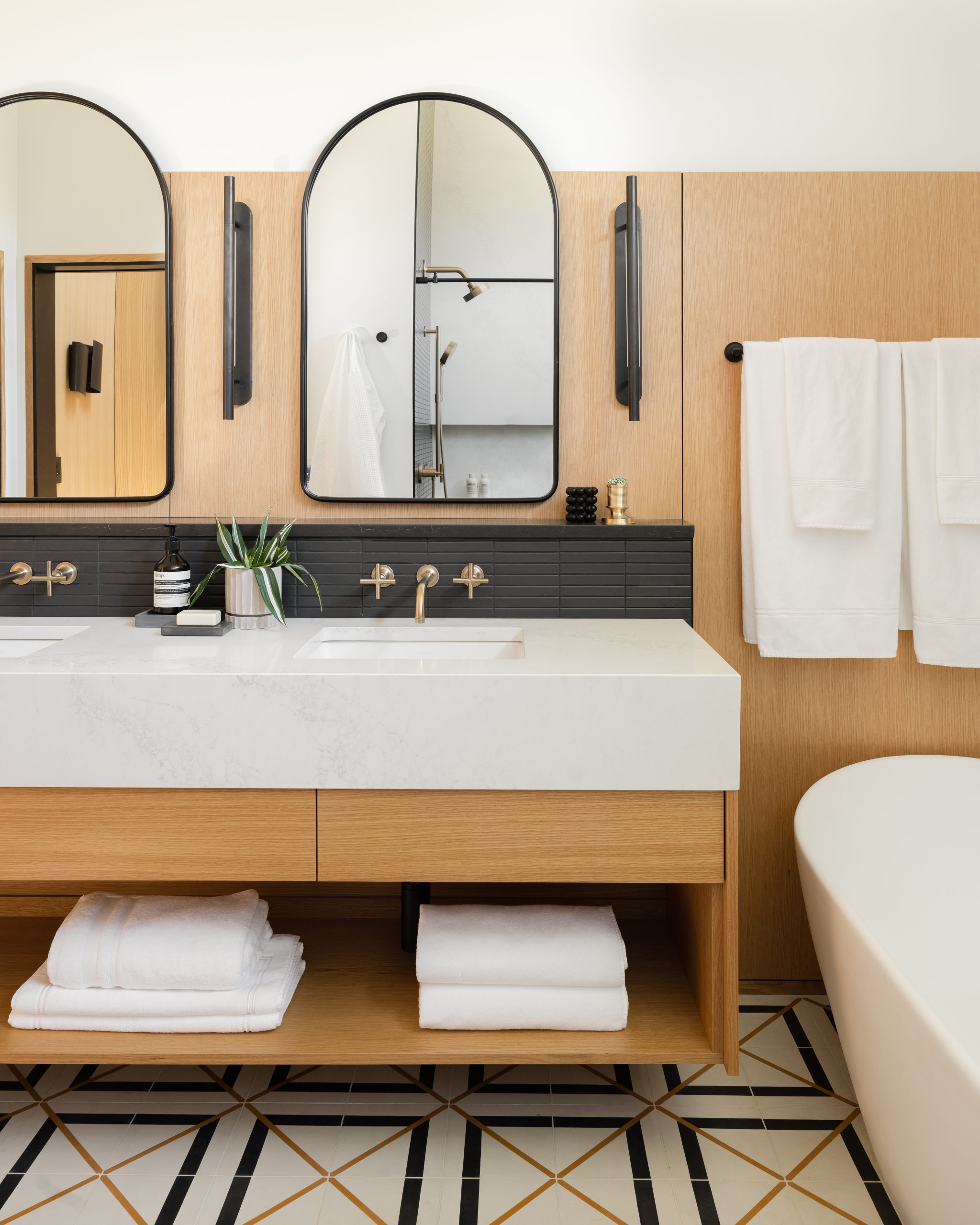
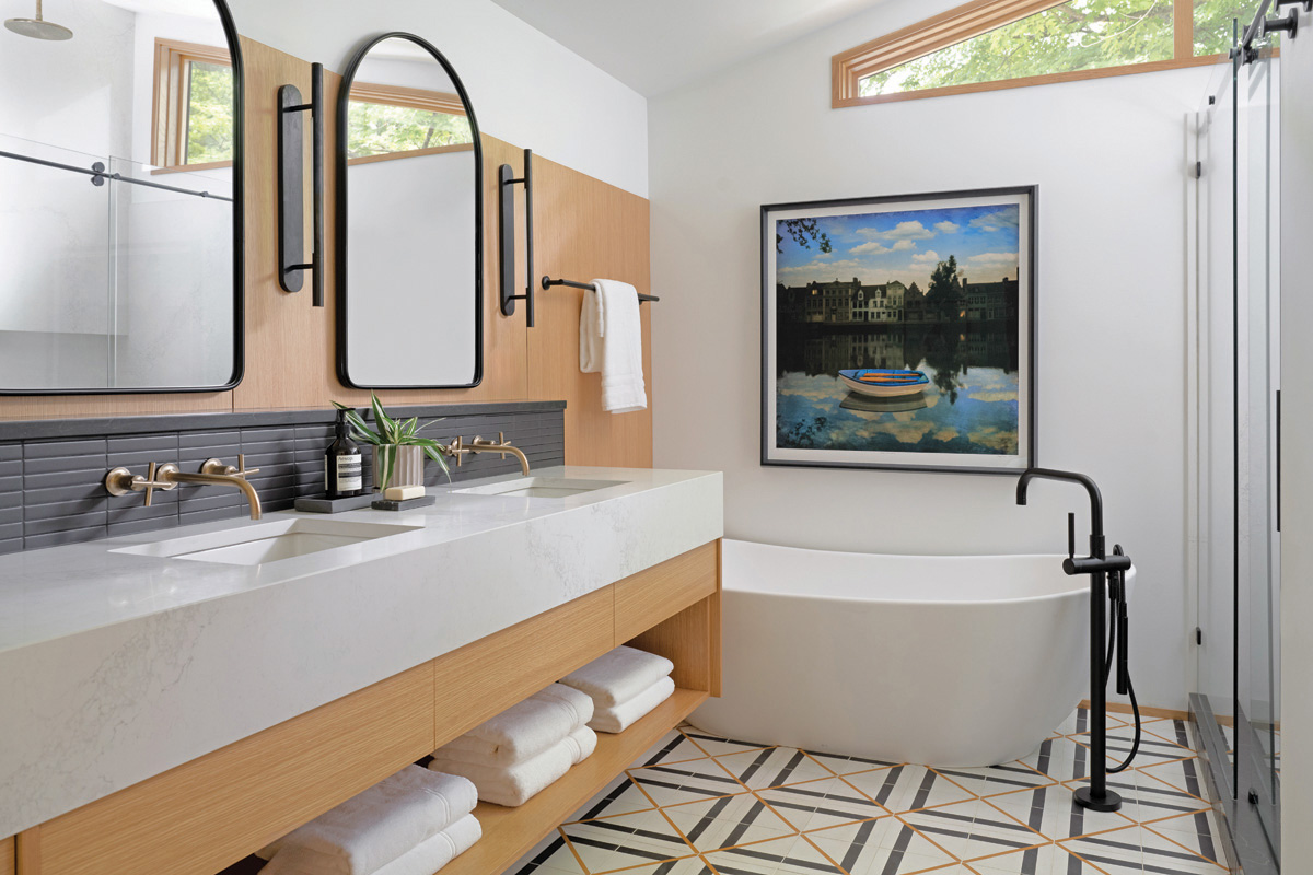
While the original part of this mid-century modern home guided the direction of its renovation, Susan Yeley and her team could have taken the primary ensuite in any direction given that it was an addition to the home. However, to maintain a cohesiveness with the rest of the spaces, they repeated many of the same elements, including rift-sawn white oak as the vanity and matching paneled accent wall tucked behind a pair of Cooper Classics arched mirrors flanked with Kelly Wearstler sconces and 1″x6″ horizontally stacked porcelain tile from Bedrosians. As well, Caesarstone’s Calacatta Nuvo quartz makes an appearance in the space as the vanity top with an extended apron front.
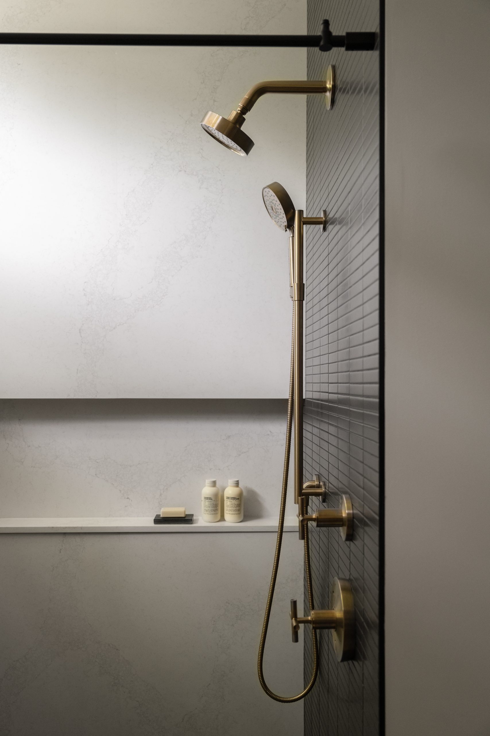
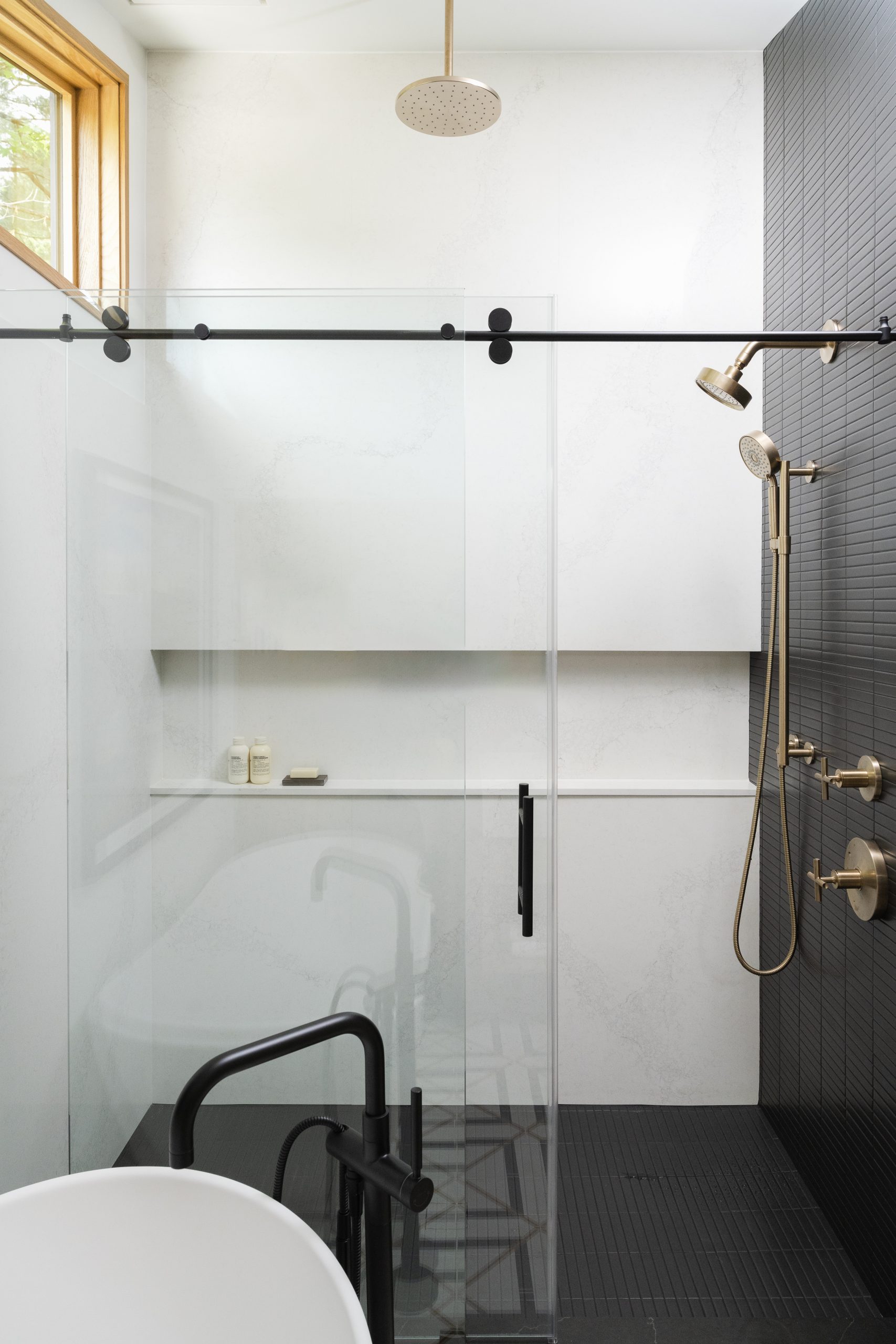
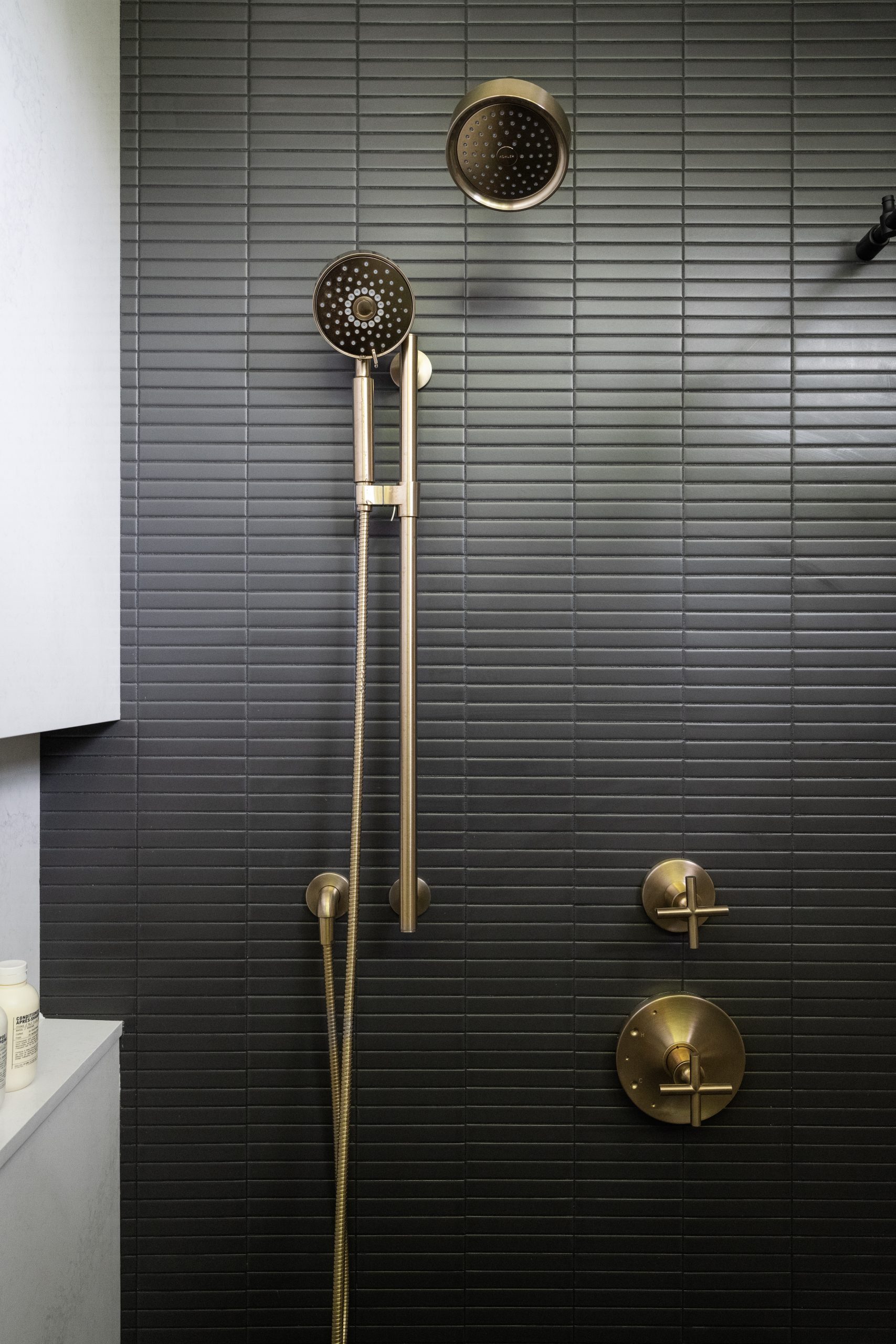
A Signature Hardware resin freestanding bathtub is accented with a Matte Black Kohler floor-mount tub filler, while the shower, which features an accent wall with the same black tile as the backsplash, showcases a Vibrant Brushed Bronze showerhead and trim. The latter matches the vanity wall-mount faucets.
Both colors, gold and black, are represented in Zia Tile’s 8″x8″ Brixton cement tile that clads the heated floor.
“The beautiful mustard-colored lines are phenomenal with the white oak,” she says. “Extending the tile beneath the vanity, which is floating to offer a sense of airiness, accentuates its beauty. Cement tile may not be as low maintenance as ceramic or porcelain, and it can be difficult to work with, especially in the middle part of the country, but it comes in some gorgeous patterns. And, it has such a beautiful ‘hand’ to it with a lovely, smooth texture. It’s hard to steer clear of!”