
Over the past few years, designers have seen countertops play a much greater role in kitchen design. Need something durable and kid-friendly? Or maybe a client wants something ‘historical’ or showstopping. In the most difficult of scenarios, it might be a combination of all of those requirements. Fortunately, there is an array of material choices available to suit a variety of functional and aesthetic needs.
As part of this month’s focus on surfacing, KBDN asked designers to share projects that highlight how today’s countertop choices can enhance the aesthetics and function of kitchens.
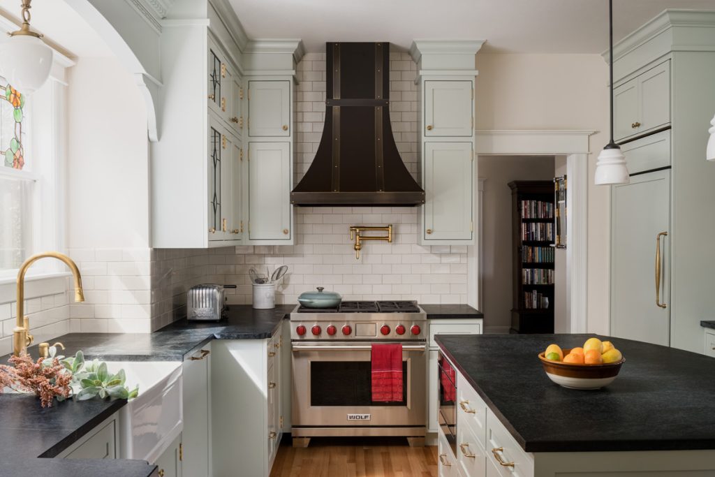
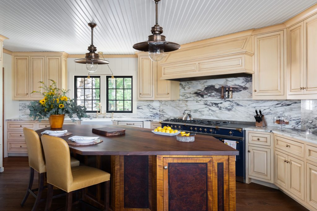
Judith Wright Sentz, CKBD, CLIPP
Judith Wright Design – Seattle, WA
Soapstone (island, perimeter)
Whenever clients want an opinion about using soapstone in their kitchens, Judith Wright Sentz invites them to her own home so they can get a realistic representation of how it will like after years of use.
“I have soapstone countertops that I put in over 20 years ago,” she remarks. “They are rustic and patinaed with scratches, chips and rough edges. But they are perfect for my 100-year-old house.”
The designer admits that the look isn’t for everyone, but when she brought this particular client to her home, the homeowner fell in love with the soapstone, imperfections and all.
“This client also has an old home, built in 1916, and she wanted something that looked vintage,” Wright Sentz explains, noting that other vintage and vintage-style elements were incorporated into the home, including unlacquered brass plumbing fixtures, which, like the soapstone, will patina over time. A stained-glass window that was original to the home hangs above the sink. It is complemented with made-to-look-old leaded glass doors on several wall cabinets. As well, the existing hardwood floor was refinished.
This homeowner also wanted a countertop surface that wasn’t too glossy and shiny, and soapstone, left untreated, has a dull finish.
“Its naturally honed surface reduces glare that may filter through the bare stained glass window, which we didn’t want to cover with a window treatment,” she says, adding that clients who prefer a darker, glossier finish can treat the soapstone periodically with mineral oil or wax. Other characteristics that many homeowners appreciate is that soapstone is non-porous and very dense, making it heat resistant. Given its high concentration of talc, it also feels relatively ‘soft’ to the touch compared to other natural stones.
Countertops, in general, are one of the first design elements Wright Sentz selects with her clients.
“I like to start with countertops because there are fewer ones that people will fall in love with, compared to cabinetry styles and colors, plumbing fixtures, etc.,” she offers. “That, then, leads into the color palette and selection of other materials and finishes.”
The soapstone slabs this client fell in love with lean towards green, which influenced the selection of Sherwin Williams’ Comfort Gray for the custom cabinetry. Used as the perimeter and island countertops, Wright Sentz included a scallop detail at the corners to add interest.
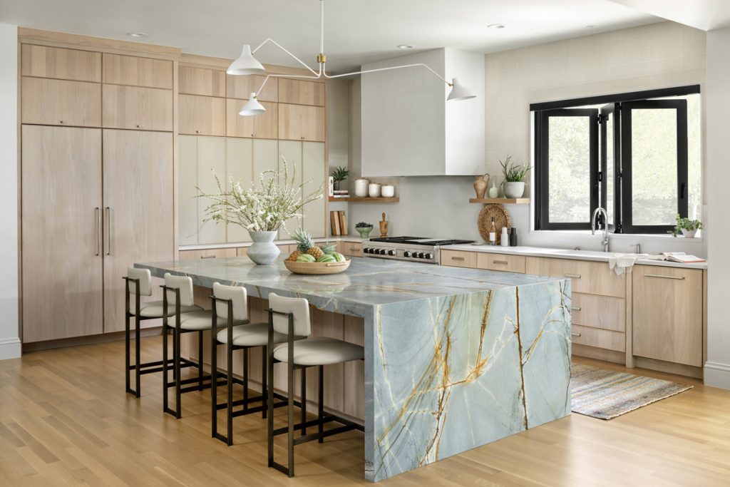
Robin Bryant, design team lead, NCIDQ certified
Factor Design Build – Denver, CO
Blue Marine quartzite (island)
Caesarstone Cloudburst Concrete quartz (perimeter)
There is no denying who is the star in this renovated kitchen. While the room’s supporting cast – such as the whitewashed white oak cabinetry, the white chandelier and the iridescent glass tile backsplash – are beautiful, it’s the Blue Marine quartzite that sits atop the island that commands the greatest attention.
“These clients really wanted a showpiece stone to act as a centerpiece in the kitchen,” reports Robin Bryant who notes a collaboration with Beth Armijo Interiors. “Everything else is muted, and more supportive, so the quartzite can be the focal point.”
To further showcase the natural stone’s grandeur and its vibrant bronze/gold veins, the island is finished with a waterfall edge.
“It brings in a more contemporary element,” she explains. “And it makes the island feel more like a single unit rather than a bunch of cabinets with a countertop set on top of them.”
Because her clients have two small children, durability factored into the material selection process as well.
“They needed something that would hold up to the wear and tear of a young family,” she relates. “When clients want to use natural stone, we always like to discuss its pros and cons. With quartzite, you can get beautiful colors and veining patterns similar to marble, but with greater durability. And when compared to granite, it isn’t quite as hard, but it is more resistant to staining, etc. than marble.”
Durability is also championed by the Caesarstone Cloudburst Concrete quartz that serves as the perimeter work surface.
“This soft, creamy white/gray quartz looks similar to concrete, and it gives a more organic look than some other quartz materials,” notes Bryant. “I find that this one has a nice ‘softness’ to it.”
The quartz’s matte finish also plays into the mix of finishes that are used throughout the space.
“This kitchen has an interesting play of finishes…with glossy, satin and matte all represented,” the designer says.
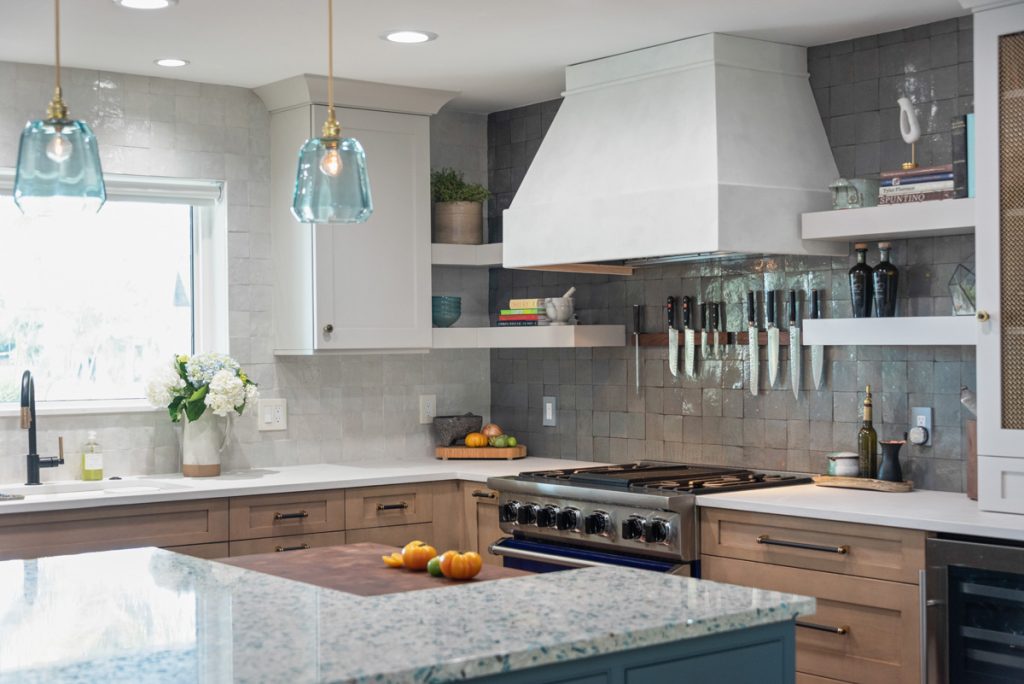
Brooke Eversoll, CMKBD, owner/principal designer
Bee Studios – St. Petersburg, FL
Vetrazzo Bretagne Blue recycled glass (island)
Caesarstone Cloudburst Concrete quartz (perimeter)
The focal-point island in this renovated kitchen takes on a lot of responsibilities related to the room’s aesthetics and function. For starters, the recycled glass countertop, Vetrazzo’s Bretagne Blue, sets the tone for the entire space. Its blend of architectural glass and oyster shells reflects shining blue coastal waters, which is perfect given the home’s waterfront location.
“The glass is sparkly and unique,” states Brooke Eversoll. “My clients love pattern. I also designed the custom blue furniture-style island cabinetry based on one of the colors in the countertop.
“Blue is such a rare color for countertops,” she continues. “Most look very artificial, but this glass is a natural way to get blue.”
Additionally, the surface is large enough to cover the wide island, which features a John Boos Block butcher block from the clients’ previous kitchen. It sits slightly lower than the glass countertop and is positioned across from the cobalt blue Viking Range. At the opposite end, a custom 6′-diameter live-edge Guanacaste wood table sits at a height that ‘kisses’ the surface of the glass.
“Our clients love to entertain, so we designed this table to be the ‘chef’s experience’ where guests can interact with their hosts as they prepare a meal,” Eversoll explains.
While the island garners the most attention, the perimeter is also designed for aesthetics and function. There, Caesarstone’s Cloudburst Concrete honed quartz tops the cabinetry.
“The ‘soft’ quartz becomes an elegant backdrop to the more exciting island countertop and tile finishes, including the zellige tile backsplash behind the range,” the designer says. “The irregular tile was selected to complement the glass countertop and provide an homage to Old World Italy, in a new modern way.
“This space has a multitude of exciting elements and is anything but ordinary,” Eversoll continues.
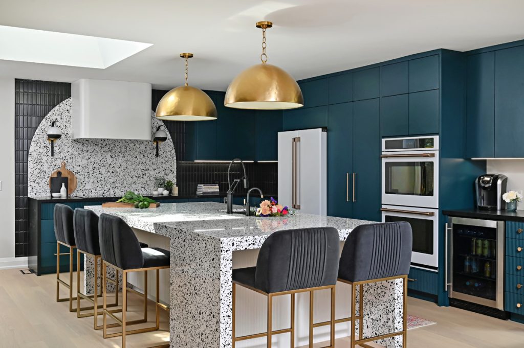
Cynthia Soda, owner/principal interior designer
Soda Pop Design – Toronto, Canada
Cambria Vail Village quartz (island)
Caesarstone Empira Black quartz (perimeter)
Although this ‘hot pink kitchen,’ as it is affectionately referred to by the Soda Pop Design team, didn’t end up being its namesake hue, a discussion about the possibility of it being hot pink was the inspiration for the kitchen’s bold finishes, including the Cambria Vail Village quartz island countertop.
“When we first met our clients, we realized they weren’t ‘beige’ people,” Cynthia Soda recalls. “They’re a young, vibrant couple with two young boys. As we discussed the renovation of their outdated and impersonal kitchen, they were excited and open to just about everything, so we wanted to take that energy and give them something with a bit of rock ‘n roll that amped up the fabulous.
“We asked them how willing they would be to jump in with our ideas, even if they were for a hot pink kitchen,” she continues. “Their response was that they would be game for anything…as long as we felt that it worked! The bright teal cabinetry, and the quartz countertop, came out of our design process that led us to create something fun and alive, something that balanced function, pattern, color and personality for the busy family, while making sure their zest for life and energy was felt in the final reveal.”
The bold quartz fits perfectly given its blend of black and white, accented with gray specks to soften the high contrast. Soda further showcased the quartz by giving the island three waterfall edges, one that faces the cooktop and an additional two that flank seating at the opposite end.
Additional vertical plane highlights of the quartz include an accent piece behind the induction cooktop. Its curved top pays homage to other arched elements throughout the kitchen and adjacent areas, including the oversized pendants above the island, the curved cabinets in the dining room and an arched doorway that leads into the media room/lounge space.
For the perimeter worktop surface, Soda selected Caesarstone’s Empira Black quartz.
“The dark quartz gives a nod to the main showstopper quartz, without fighting for attention,” she explains. “It has a bit of veining that makes it look natural and keeps it from being too dark. Compared to white, which we also could have used, the black fades a bit into the background, providing a nice complement to the cabinetry.”
Alicia Torosian, principal designer
Alicia Torosian Design – Corona Del Mar, CA
Magnifica Encore Calacatta Oro (island, perimeter)
Alicia Torosian has been working with and specifying porcelain products, as countertops, backsplashes, floors, etc., in her designs for years. Over the course of that time, she has seen many advancements made in its fabrication. One of those she appreciates most is the relatively recent change made in the printing process that results in slabs and tiles that more closely mimic natural stone, such as the Magnifica Encore Calacatta Oro used in this kitchen.
“Porcelain is so underrated,” she indicates. “It’s come so far in the past five years. Patterns that are made to look like natural stone are much more realistic. Porcelain is also durable, has a relatively low price point and it can be used indoors and outdoors.”
All of those qualities played a role in the selection of porcelain as the countertop surface in this home in Newport Beach.
“Countertops are one of the most important pieces in the design of a space because they can pull a whole room together,” the designer says. “I chose porcelain for this kitchen because of its durability, beauty and resemblance to stone, without the maintenance of stone. Plus, the benefit of using porcelain in this kitchen is that we have a passthrough window that connects the kitchen and outdoor patio so we were able to use the same countertop indoors and outdoors.”
Torosian selected a polished finish to elevate the space, and to coordinate with the polished nickel faucet and cabinet hardware. “I also love how the porcelain looks with the glossy tile backsplash,” she adds, in reference to the Zagora Blanc zellige tile. “It just feels right.”
As well, the designer used porcelain, Magnifica Encore Luxe White in a honed finish, in the primary bathroom where she mixed slabs for the vanity top and backsplash with subway tiles on the floor.
“I love how the different sizes all work together and coordinate,” she says.
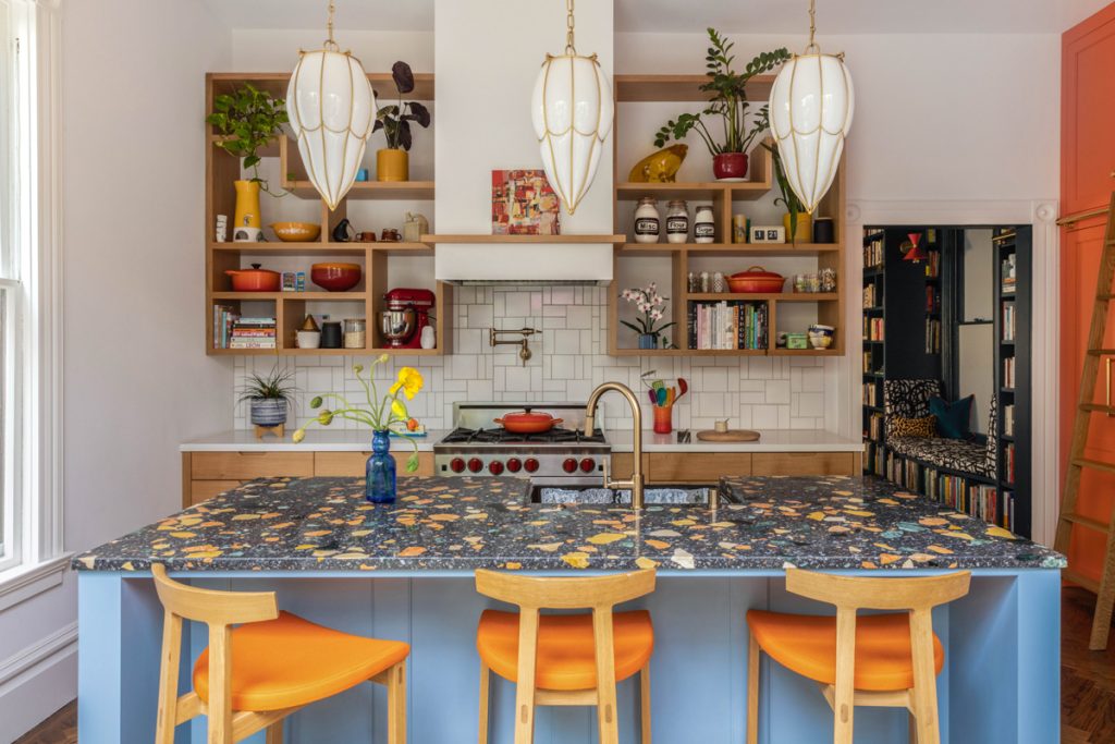
Noz Nozawa, principal designer
Noz Design – San Francisco, CA
Dzek Marmoreal Black marble terrazzo (island)
Caesarstone Frosty Carrina quartz (perimeter)
Vibrant, cheerful and colorful were all words that Noz Nozawa’s clients used to describe the vibe they wanted for their kitchen, which the designer renovated in collaboration with SF Design Build.
As such, blues and oranges are prominent hues used throughout the space. The former sheaths the island cabinetry while the range and several accessories represent the latter. The floor-to-ceiling larder/pantry (custom built by Brimer Workshop) also boasts the bold orange color.
Both colors are found in the island’s worktop surface, Marmoreal’s engineered marble. The aggregate terrazzo showcases an array of colorful classic Italian marbles – Rosso Verona, Giallo Mori and Verde Alpi – within a sea of black Grigio Carnico.
“We loved that this terrazzo includes stone that skews blue-green and orange, as these were colors we envisioned on the cabinetry,” says Nozawa. “The multiple colors of large-chip natural stone embedded in the material adds a dynamic surface to this kitchen.”
The designer selected the matte option. “Since this kitchen has a lot of visual interest already, the more subdued look of a honed surface was my preference,” notes Nozawa.
The designer also loves to mix countertop materials when viable, and used Caesarstone’s Frosty Carrina quartz for the perimeter surfaces. “We wanted the range wall to stay more neutral in color since the pantry wall and island are so saturated,” she explains. “The white perimeter countertops are perfect in that context, which makes the island countertop the star.”
Ann Stillman O’Leary, designer
Evergreen House Interiors – Lake Placid, NY
Walnut butcher block (island)
Calacatta Viola marble (perimeters)
Ann Stillman O’Leary’s clients knew that butcher block and marble wouldn’t necessarily be low-care choices as countertop surfaces for the kitchen in their new-construction, Adirondack-style ‘camp’ home sited in the mountains of New Hampshire. However, their desire for the rustic elegance that the walnut butcher block island top and the Calacatta Viola marble perimeter worktop surface provide far outweighed any maintenance they would require.
“She wanted what she wanted,” says O’Leary, noting her clients’ desire for a French chef’s-style kitchen, which is supported by the countertop selections as well as the bold blue Lacanche range and Buttercream painted perimeter cabinetry that is glazed to make it appear somewhat aged.
The butcher block, set atop the unique butterfly-shaped island, serves as a spacious chopping surface positioned conveniently near the range. Its dark walnut composition complements the custom hand-scraped hickory floor and the burl walnut and fiddleback maple base cabinetry, which is custom built to resemble furniture. Ann-Morris station pendant lights hover above the island, suspended from a painted beadboard ceiling.
“Oftentimes, butcher block is maple,” she relates. “However, in this kitchen, the ‘blondness’ of maple would have been too light. We wanted something darker, and since maple doesn’t take a stain very well, we opted for the walnut.”
The Calacatta Viola marble, which serves as the perimeter worktop surface, is given an antiqued finish to ‘age’ the kitchen, which is intended to look like it is part of an older lake house. Using the marble as the backsplash, as well as a narrow shelf above the range, promotes a clean, seamless design.

Earl Lawson, owner
V6B Design Group – Vancouver, BC, Canada
Cosentino Dekton Natura (island, perimeter)
Earl Lawson finds that he often turns to Cosentino’s Dekton sintered stone for his design projects. He credits its durability as one reason why, but the consistency of its patterns, which is especially appreciated in those that resemble marble, is a plus as well.
“That consistency makes it possible to miter joints and grain match [multiple pieces] for waterfall countertops and backsplashes so the veins flow continuously,” he says.
Such was the case in this penthouse kitchen, where the designer used Natura for the countertops and backsplash and as the façade for the fireplace in the adjoining living space. Designed to replicate marble, it features soft gray veining on a white background. Its polished finish adds a crystal-like shine to the space.
“Our clients wanted a naturally modern kitchen,” he says. “The slim shaker-style doors on the cabinetry bring clean, soft, contemporary lines while the turquoise finish provides a unique, bright and modern color. The sintered stone countertops complement the look with a clean, natural stone element that anchors everything. Between the turquoise color and the Natura countertops, the ‘specialness’ of the space is immediately apparent.”
The material’s availability in large slab sizes is generally a plus since it minimizes seams. But Lawson was challenged about how to get the large island countertop piece up to the kitchen’s penthouse level.
“We considered using a crane to lift it over the house and to the back patio,” he recalls. “But that was expensive, technically difficult and potentially risky, so we decided to modify the stairwell landing areas to open up some of the tight corners. This not only allowed us to move the countertop up the stairs, but it also provided a more attractive entrance to the space.”
Another benefit of the material is its heat resistance and its availability as a thin slab. Both proved beneficial in its use as the fireplace façade in the adjoining living space.
“Being able to use the same material in the kitchen and living space really brings the two rooms together,” he adds. ▪