
Incorporating color into a kitchen or bathroom space can be an intimidating proposition to some homeowners. But as design continues to move away from monochromatic white and gray color schemes, more vibrant palettes are emerging.
“Color is coming in because people want to bring personality into their spaces,” says Jamie Banfield, principal designer, Jamie Banfield Design in Port Moody, BC, Canada. “They don’t seem to be as afraid of color right now.”
Erika Woelfel, v.p. of Color & Creative Services at Behr, agrees, adding, “Consumers are looking at color choice as an opportunity for empowerment and embracing the self-expression it can allow. While neutrals will never go out of style, we anticipate color choices to continue to go bolder beyond 2024.”
Hannah Yeo, senior manager, color marketing at Benjamin Moore, notes that 2023 ushered in the use of eye-catching color in the home, which is a trend she anticipates continuing into 2024. “There is a willingness to explore color and express personality in the home,” she reports. “With an abundance of information online, most homeowners are educating themselves about color and design. And with that, every design element becomes more thoughtful and meaningful to the people living in the space. We foresee this personalization continuing beyond 2024. Flexibility, wellness and sustainability are top of mind, which will certainly impact the colors we surround ourselves with.”
Jonathan Gordon, owner/lead designer, Design by the Jonathans in New Haven, CT, also loves to incorporate color into his designs, and echoes the sentiment of making each selection purposeful. “I love using color, but, at the same time, I also don’t mind not using it,” he remarks. “What I’m looking for is visual interest. Everything should have a reason to be…according to the French phrase, raison d’être.”
Alexander Adducci, senior designer at 210 Design House in Chicago, IL, shares the same philosophy about purpose. “For me, it’s all about using color with intention to boost the overall ambiance and add to a positive emotional experience,” he states.
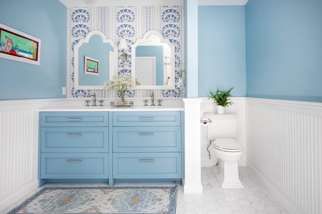
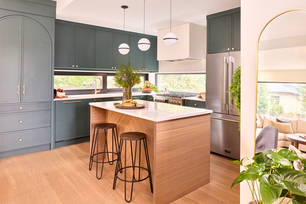
Photos: Robert Norman Photography
Blue and Green Still Reign
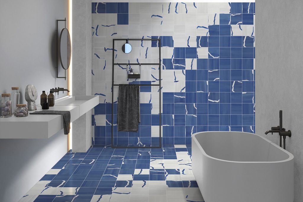
As far as trending colors, blues and greens are still at the forefront, in part because of their connection to nature, but also because of their ability to soothe and to ‘play’ well with others. Shades of the hues vary, depending on whom you ask.
“We can expect to see a variety of blue hues being used in 2024,” says Brittney Harmond, a representative of Ceramics of Italy. “It’s a great color for homeowners to embrace. Deep navy-hued tiles can be used to create a captivating backsplash or accent wall that adds a touch of drama, while dusty or pale robin’s egg-hued tiles can evoke a relaxed, spa-like setting.”
“When it comes to greens and blues, we’re leaning into those deep, moody shades, stepping away from the super bright hues of the past,” adds Adducci. “On the flip side, lighter tones contribute to an overall feeling of freshness and expansiveness, cultivating an airy and inviting atmosphere.”
Gordon sees the hues moving a little lighter, more mid-tone and muted. “A lot of people are going for a muted blue or green with a little bit of taupe or gray…earthy tones,” he explains. “Dusty mixes are in versus pure colors. People are also looking for a variety of tones within the same color. One solid color doesn’t cut it. People want to see a variety and a bit of imperfection so the space doesn’t feel sterile.”
The designer cites tile, especially that which is handmade such as zellige, as an example where various shades of the same hue create depth and add texture. “Color sometimes takes a backseat to texture these days,” he observes. “But it isn’t that you shouldn’t expect to see color. Color should definitely be part of it. But it may arrive in unexpected ways, such as an imperfect texture on top of an existing color like a marble instead of a pure white, or a slate instead of pure black.”
Gordon also sees color, as well as matte white and black, making a bolder appearance in appliances. “People are loving colored appliances,” he says, noting that in his own kitchen he mixed dark charcoal cabinetry with a French blue range with brass hardware. “With colored appliances, people aren’t committing to an entire wall of cabinetry. Instead, they can bring color forward without doing it in such a permanent way. The same can be said for accent walls and wallpaper that can be brought in in beautiful colors.”
Given the neutrality of green and blue, Stephanie Pierce, director of design and trends with MasterBrand Cabinets, anticipates the colors to remain popular through 2024 and beyond, stating, “Not only are these the two easiest colors to work with from a sense of neutrality, meaning they work well with many other colors, but they are also highly complementary to the warmth and wood tones that are in the early days of their comeback. When there is still movement in the development of tones as there is for blues and greens, it means the trend is still evolving and will remain on-trend for a while.”
Banfield also appreciates blues’ and greens’ impartiality. “They are relatively safe for bringing in personality,” he says. “They have longevity and are timeless, ‘heritage’ colors that have been used in kitchens and baths for a very long time. It’s also easy to pair blues and greens with light- and dark-colored woods and natural stones such as travertine and unlacquered copper and brass that we see coming in. And, they can be masculine or feminine, which makes is easier for a husband and wife to agree [on a color].”
Meghan Howell, North American design and creative director at Formica, adds, “Because we are so familiar with them in nature, blues and greens are quite easy to work with, so much so that many even consider them neutrals. As we emerge from a decade of whites and grays, adding in blues and greens is an easy first to step to add color back into interiors.”
She indicates that tones lean towards nature, such as gray blues, sage, mossy or even evergreen greens and deep navies. “As the colors of the ocean, sky, plants and forests, these hues all can lend a nature-inspired tone to the home,” she explains. “The warming up of interiors and the integration of biophilic colors like blue and green are natural responses to the fatigue of decades of white on white, or white and gray interiors. Trends ebb and flow, with colors rising and falling in popularity every so often, and we’re back to the resurgence of more colorful interiors.”
Mark Woodman, owner/principal of Mark Woodman Design + Color in Laurel, MD, echoes the power of Mother Earth as it relates to design. “Blue and green will continue as part of the ongoing embrace of nature in the home,” says the Color Marketing Group member and aesthetics consultant for Corian Design. “Those two colors, in addition to terracotta, are the most recognized colors for land, water and air. I am tracking them to lighten up and offer a bit of color whisper. They will feel fresh, as though emitting a soft breath or an early bud of green in the garden. There is a small tinge of innocence and peace as well. The lighter blues and greens will complement ever-present whites, as well as burgeoning stained wood.
“In addition, the varying values of terracotta, which are already making appearances in design, will add a firm visual connection not only to the planet, but to handcrafted and natural materials,” he continues. “The color will likely range from soft to ruddy orange, the lighter extreme creating a modern take on the color, while the darker offers a grounded, classic vibe.”
Sue Wadden, director of color marketing for Sherwin Williams, reiterates nature’s influence as well, adding, “We’ve seen nature-inspired colors taking over since the beginning of this decade. Since these shades are rooted in nature, they are inherently grounding and calming, which is something homeowners are craving in this decade.
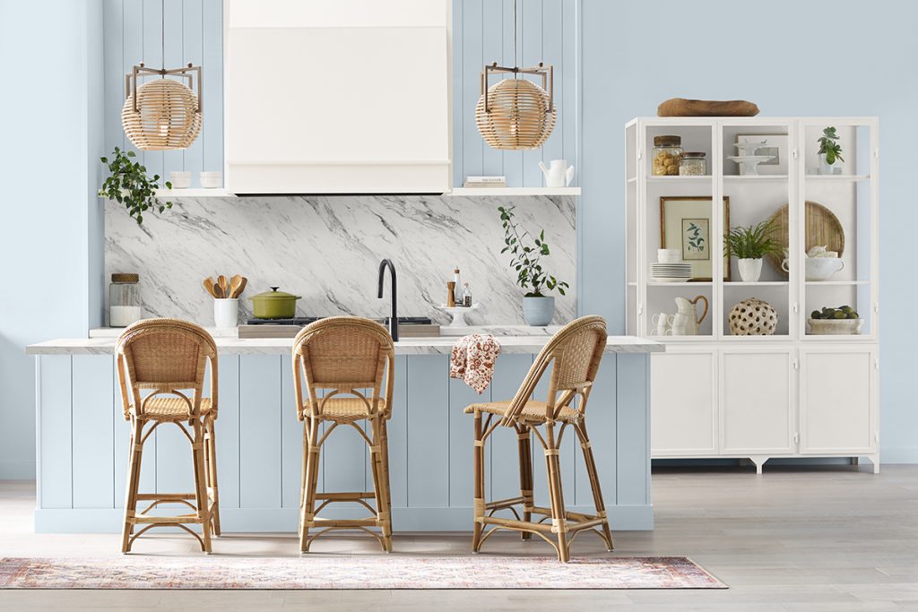
“We’re going to see a rise in popularity in either very light shades or very deep shades, like deep navy blues and light breezy blues being equally as popular,” she continues. “We’ve also seen a rise in popularity in wooden accents, which work well with light blues and light neutrals to create a coastal chic aesthetic, which we think will be the new ‘it’ trend in coming years.”
In support, the paint company selected Upward, a light breezy blue, as its 2024 Color of the Year, which Wadden indicates is a great choice for kitchen cabinets and bathroom vanities because it offers a pop of color, without being too much. “Upward also evokes a sense of tranquility and peace in the home,” she relates. “We anticipate that 2024 will be a charged year so people will be seeking peacefulness wherever they can, especially in their homes. To find this peacefulness, colors that evoke joy and calmness will be big in the coming year.”
Likewise, Benjamin Moore chose a blue hue, Blue Nova, as its Color of the Year. An intriguing blend of blue and violet, Yeo relates that it sparks adventure, elevates the everyday and expands horizons. “It has a duality that bridges the warm and cool, and light and dark, which reflects the current sentiment: the need to explore and express oneself with the undercurrent of comfort and reassurance,” she says. “Blue Nova is fantastic on cabinetry…think of a kitchen island, base cabinets or a vanity. It also offers an opportunity to be creative by using it to drench a room in color or define a portion of a room with its captivating hue.”
As the paint company’s color team considered color trends, Yeo indicates that two themes emerged: travel and juxtaposition of light against dark and warm against cool.
“As a macro trend, we found that a major source of color inspiration is travel,” she explains. “Whether it’s a road trip to a nearby destination or to outer space, our Color of the Year and our Color Trends palette spark adventure and invite consumers to explore the extraordinary that bring people to new places and experiences. Likewise, there’s a story of duality that showcases complementary and contrasting color pairings. Interesting combinations came through that relate back to color relationships on the color wheel that play with saturation, value and undertone, making them memorable.”
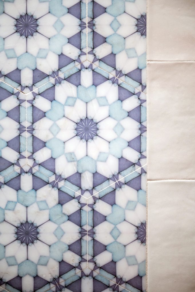
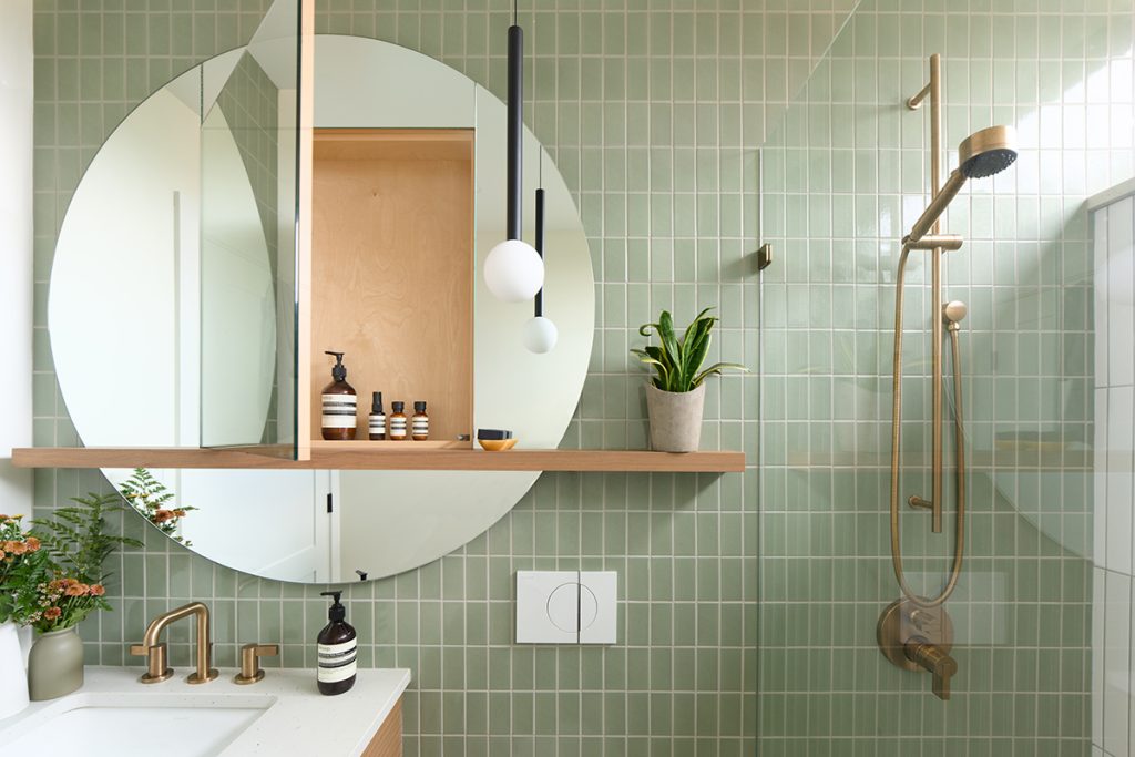
Photo: Janis Nicolay Photography
Banfield has also noticed the influence of travel on color choices within the home. “The way the world has been the last couple of years with regard to the pandemic, being outdoors is important, so people are interested in showcasing different elements from the outdoors…such as matte finishes, plants, beach wood…we’re craving an organicness,” he stresses. “But we’re also seeing color coming through because people are reminiscing about vacations and experiences, such as dining in a fine restaurant, drinking a cocktail at a bar or sipping a coffee in a coffee shop. Details they see, like a harvest table or green stools, find their way into their spaces.”
Likewise, Pierce notes that cultural or generational shifts highly influence style trends. “Younger generations are more quickly embracing a shift from minimalism to more traditional style enhancements, and the embracing of multi-cultural influence brings us pops of color, textures and patterns,” she says. “I, not so secretly, love that wallpaper is back!”
Interestingly, but maybe not surprisingly, Adducci notes the power of the fashion industry on color choices. “I think home color choices, today, are a blend of personal expression and influences from the fashion industry,” he explains. “My clients increasingly draw inspiration from their own tastes, all while mirroring the trends in the fashion world. Whether replicating the tonal look of a brocade jacket, or incorporating bold metallic details, the connection between personal style and home aesthetics is apparent. It just takes Valentino to put out that red, and then the color is everywhere!”
Warmth ahead
While blues and greens are expected to remain popular, many experts within the design industry are seeing other colors join them, especially any hues that lean warm and/or work well with wood.
“As I look ahead to what homeowners are loving, there’s a clear pull towards the cozy vibes of medium wood tones and comforting warm whiskey colors, especially in kitchens and baths,” reports Adducci.
As an example, Pantone’s Color of the Year is Peach Fuzz, a warm and velvety shade. “Greens and blues will always factor into consumer preferences and choices as they are universal favorites,” says Leatrice Eiseman, executive director for the Pantone Color Institute, noting that the hues are heavily featured in the Pantone View Home forecast for 2024.
Photos: Martin Knowles Media
However, the institute notes that, at a time of turmoil in many aspects of people’s current lives, there is a need for nurturing, empathy and compassion. “A cozy peach hue softly nestled between pink and orange, Peach Fuzz brings belonging, inspires recalibration and an opportunity for nurturing, conjuring up an air of calm, offering us a space to be, feel and heal and to flourish…” she continues. “Drawing comfort from Peach Fuzz, we can find peace from within, impacting our wellbeing. An idea as much as a feeling, Peach Fuzz awakens our senses to the comforting presence of tactility and cocooned warmth.”
Woelfel agrees that nature-inspired hues like blue and green will remain a popular choice for bathrooms and kitchens, noting they are part of Behr’s 2024 Color Trends palette. “But we also anticipate warm colors to be highlighted in 2024, as oranges and yellows can stimulate enthusiasm, energy and creativity in spaces,” she remarks. “Overall, there will be a leaning towards warmer and earthier colors that energize a room.”
As well, she indicates that color experts at the paint company see consumers being drawn to darker and bolder hues, such as Cracked Pepper, Behr’s 2024 Color of the Year.
“While the trend of previous years of seeking comfort and belonging in our spaces will continue to drive design decisions, in 2024, life is returning to its normal rhythms, which is creating a new desire to awaken the senses in the home,” she says. “Darker and bolder hues throughout the home can provide a sense of confidence while serving as an anchor in the room. Our Cracked Pepper can be used as an accent color for cabinets, or the soft black can wrap around all of the walls for a simple statement.”
Color experts at PPG Architectural Finishes’ Glidden have also noticed a shift. “We’ve seen greens and blues be the ‘it’ shades for so many years,” states Ashley McCollum, Glidden paint by PPG color expert. “They have the natural ability to calm, soothe, heal and bring organic energy into a space, and they are part of our palette of 10 trending colors that we create to help consumers pair colors with our Color of the Year selection, Limitless. But with our research for 2024 and beyond, we’re starting to see shades other than blue and green take center stage.”
Photos: 210 Design House
Case in point is Limitless, a warm honey beige that offers an energizing take on a neutral, and the company’s Color of the Year runner-up, Sweet Spiceberry, a bold, warm, red-brown. “We’re definitely seeing color lean toward warmth, with dustier tones pulling through…more so than we’ve seen in previous years,” reports McCollum.
She attributes that move to consumers’ interest in versatile and timeless colors that can stand on their own, or support other colors that are already in the home. “It’s about creating a cozy, welcoming environment while also expressing oneself,” she explains. “We’re entering a new era of explosive creativity and change where consumers have an unmatched desire to really express themselves, to have a deeper sense of self identity and connection to the environment. So, Limitless really offers consumers limitless ways to use it. It can be whatever they want it to be.”
The honey beige also pairs well with the warmth being seen in other elements within the home, including plumbing and lighting fixtures and cabinetry hardware, all of which are currently trending towards gold and brass, as well as countertops, cabinetry and tile.
“As we’re coming out of a decade or more of white, white and more white, it’s refreshing to see countertops with more depth to their color and texture,” states Howell. “Light countertops are warming up with creams, beiges and browns, and even a gray top may lean on the warmer side. Marble patterns now have brown or terracotta veining instead of gray and black. In general, we’re seeing countertop colors will be lighter than cabinets, with a matte or honed texture. These colors work nicely with wood and painted cabinets, as well as the range of hardware materials being selected today.”
As well, Pierce is seeing an evolution of white into beige. “These won’t be boring beiges, but rather soft mocha tones that can still behave as neutrally as white, while also bringing in additional warmth to spaces,” she explains. “I don’t see the preferences towards neutrals going away anytime soon, but I do think colors are softening. There is more neutrality in muted hues, which opens up the opportunity for mixing and building more interesting and complex palettes.”
Adducci and Gordon also appreciate the power of neutrals, and their ability to mix effectively with color.
“I think we’re going into a neutral phase,” says Gordon. “But that’s not to say that neutral and bold can’t coexist because neutrals have become colorful. Solid, flat gray has disappeared, but dark gray and textured gray, like concrete and plaster, are ‘in.’ And beige and taupe aren’t like those we saw in the ’90s. They have come into their own.”
Adducci adds, “There’s always room for bold and bright tones to make a statement, but I foresee a surge in softer, more neutral hues because there’s a growing appreciation for tranquility and a desire to create calming spaces and Zen-like environments. The evolving design landscape seems to embrace both ends of the spectrum…allowing for vibrant pops in design details and furnishings and soothing neutrals in investment pieces to provide that timeless touch.”
Ceramics of Italy also sees both ends of the spectrum. Warm, neutral-hued materials that look like stone and wood with authentic veins, grooves and depressions are popular for creating spa-like environments. But Harmond indicates that Italian tile manufacturers are also getting more experimentative and playful, introducing mesmerizing and colorful marble and onyx varieties not found in nature, alongside smaller formats in bright and vibrant colors such as orange and purple.
“Pink hues are on the rise as well,” she continues. “More and more, we’re seeing large gemstone-inspired tiles alongside glossy ceramic brick formats in a variety of pink hues ranging from shell-rose to bold magentas.”
Regardless of what is considered on-trend, in the end consumers select what fits them best, indicate many of the experts.
“Inevitably, consumers will go to the colors that fit their comfort level,” says Eiseman. “That is why the Pantone View forecast features seven palettes, each expressing different moods and variations of color that will appeal to the end user.”
Likewise, Woodman adds, “I think that variety tells the story. The macro trends can help drive the narratives, but at the end of the day, consumers need their spaces to reflect their aspirations and their stories, so a dark color from Behr and a light color from Beauti-Tone speak to valid stories and allow consumers breadth in where they fit in.”
Nevertheless, he looks forward to color being used unexpectedly. “I am watching for some brighter colors, not juvenile, but fun,” he relates. “I call that story Joie! (or Joy!). Think of the colors of French macarons or festive doughnuts. Lime, violet, bright sky blue and pink will be a part of a color world designed to elicit smiles and giggles. I think of the word ‘fizzy’ to encompass the unmitigated joy being sought. They will be perfect for accessories and unexpected places like ceilings, inside cabinetry and furniture. How fun to open a kitchen drawer in a white kitchen and have the inside burst with bright pink or kiwi green!” ▪