Choreographing the perfect dance doesn’t just happen by accident, whether it’s an elegant ballet, an upbeat country swing or a spicy salsa. Rather, those that are most seamless and successful happen when one partner leads and the other follows.
The same directive applies for selecting surfacing materials for backsplashes and countertops for traditional, transitional and contemporary kitchens. One leads, the other follows. Maybe it’s a bright and bold backsplash that leads the ‘dance,’ followed in step by a quieter countertop. Other times, the countertop takes precedent, setting the pace and tone for a kitchen that is aesthetically beautiful and functionally flawless.
This month, KBDN asked designers to share kitchen projects that showcase the special relationship between backsplash and countertop surfaces.
Mike O’Brien, Architect/Co-Founder
Change Design, Wilmette, IL
Mike O’Brien doesn’t take for granted the significance of design decisions…those he makes for his clients, as well as those he makes for himself.
“It’s very personal to be allowed into someone’s house and be able to help change how they live,” says the architect/co-founder of Change Design in Wilmette, IL. “It’s not something that we, as design professionals, take lightly. It’s a big deal.”
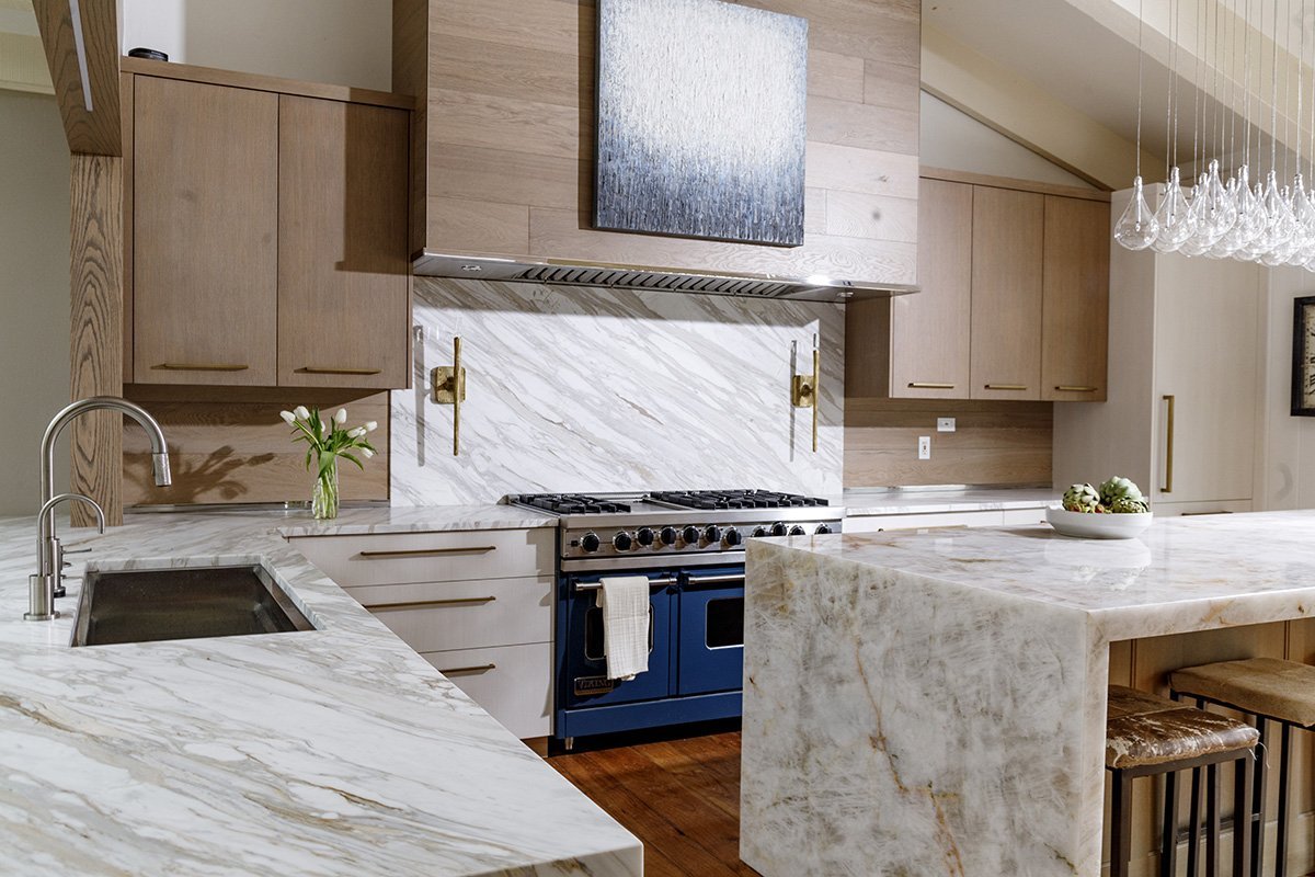
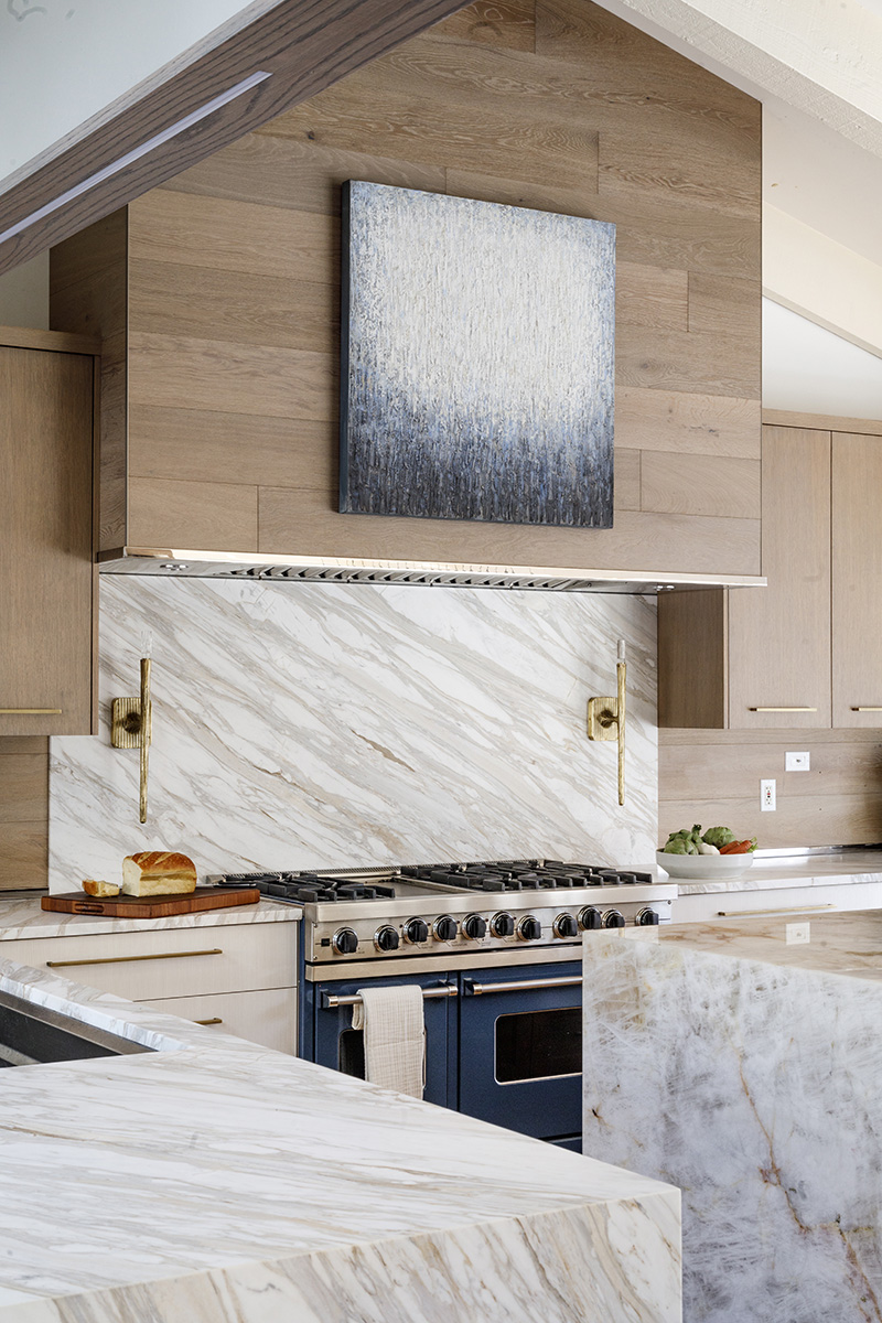
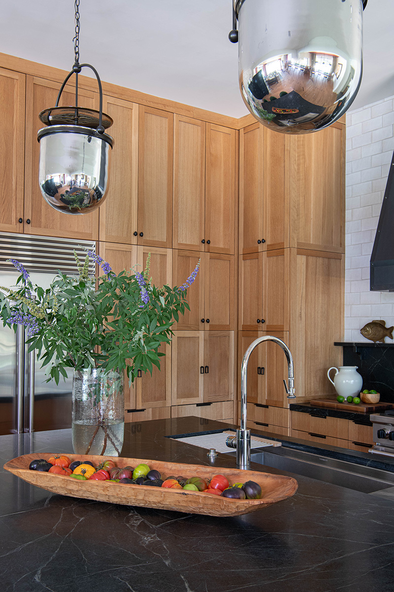
Often, when it comes to decisions about surfaces, such as those for backsplashes and countertops, he is drawn to natural stone, especially quartzite.
“Decisions are always based on a balance between aesthetics, function and cost,” he explains. “But I often find that, for myself and for my clients, I am drawn to quartzite. It has a ‘softness’ that other materials don’t have. I also like its uniqueness and its variability. There’s just something special about a material that comes from the earth. I also tend to work with clients who love to cook, so I have to be very mindful of selecting materials that are durable and resist stains, acids and heat. So, in general, quartzite is a good fit.”
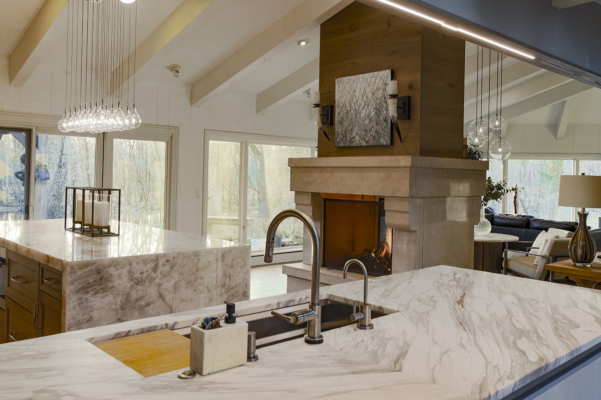
In fact, O’Brien selected Iceberg quartzite for the island in his own kitchen, which was the culminating project in a four-year, whole-house renovation. The stone’s warm white background color ties it to the white base cabinetry around the kitchen’s perimeter as well as the white painted walls. Extending it to the floor in a waterfall edge draws attention to its deeper-colored veins that complement the scraped hickory floor.
“I love using Iceberg quartzite whenever I want a lighter- colored material that is incredibly durable,” he reports, noting he also used it in several other areas of his home, including a bar and the laundry room. “It’s important to select a material that will be resistant to the planned activity, so, on the island I needed a material that would stand up to all of the prep work that happens in the kitchen.”
Because of its inherent durability, O’Brien selected a polished finish.
“A polished finish on a natural stone allows its natural characteristics to shine through and gives it depth,” he notes. “A matte finish, such as honed, satin or leathered, gives it a nice ‘touch’ while hiding things like scratches, but it reduces the ability to see into it. It’s like the old textured refrigerators…they always hid oily fingerprints! But with this Iceberg quartzite, you don’t have to hide anything.”
O’Brien also appreciates the stone’s unique translucency, which gives light the ability to shine through.
“When I open the refrigerator drawers in my island, you can see through the stone, and when the sunlight hits the edges, it glows,” he remarks.
O’Brien complemented the quartzite with Calacatta marble for the perimeters and backsplash behind the range. Both stones support a connection to the outdoors.
“I basically live in the middle of the woods,” he explains. “I have a lot of trees and even a stream. With the renovation, I really opened up the house so it’s light, bright and airy with a lot of windows to see outside, so I liked the idea of connecting the inside to the outside with a variety of materials and finishes.”
And, since marble isn’t quite as durable as quartzite, giving it a satin finish helps hide any blemishes that will inevitably happen over time.
“The marble has a very natural feel to it, with a little bit of texture,” he relates. “And without any shine, scratches and marks that will expectedly happen will be masked. I made a choice. There isn’t an expectation that the marble will stay stain- and scratch-free. But it is beautiful and it is worth the trade-off. This particular marble also has some variation and a bit more veining, so, again, when ‘life’ happens, it won’t become a focal point.”
Jennifer Taylor, Lead Designer
Jennifer Taylor Design, Tallahassee, FL
Jennifer Taylor often gets requests for traditional white subway tile as a backsplash element in the kitchens she designs. While she acknowledges that it still has its place and will likely always be popular, she likes to encourage her clients to mix it up to give their kitchens a more unique look.
“In my opinion, the traditional 3″x6″ white subway tile has been overused,” says the lead designer for Jennifer Taylor Design in Tallahassee, FL. “However, I do think that it’s here to stay, so I like to try to modernize it by using a color other than white, and/or sizes that are a bit shorter, more elongated or even taller and fatter. They just feel a bit more updated to me.”
As such, she is currently working on a kitchen renovation where the designer suggested a 3″x6″ buff/light tan colored subway tile with a beveled edge.
“People do tend to be leaning into warmer neutrals a bit,” she states. “So, for this client, who has a bit of a more formal kitchen, we paired the tile with brass accents.”
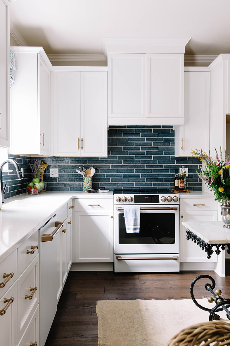
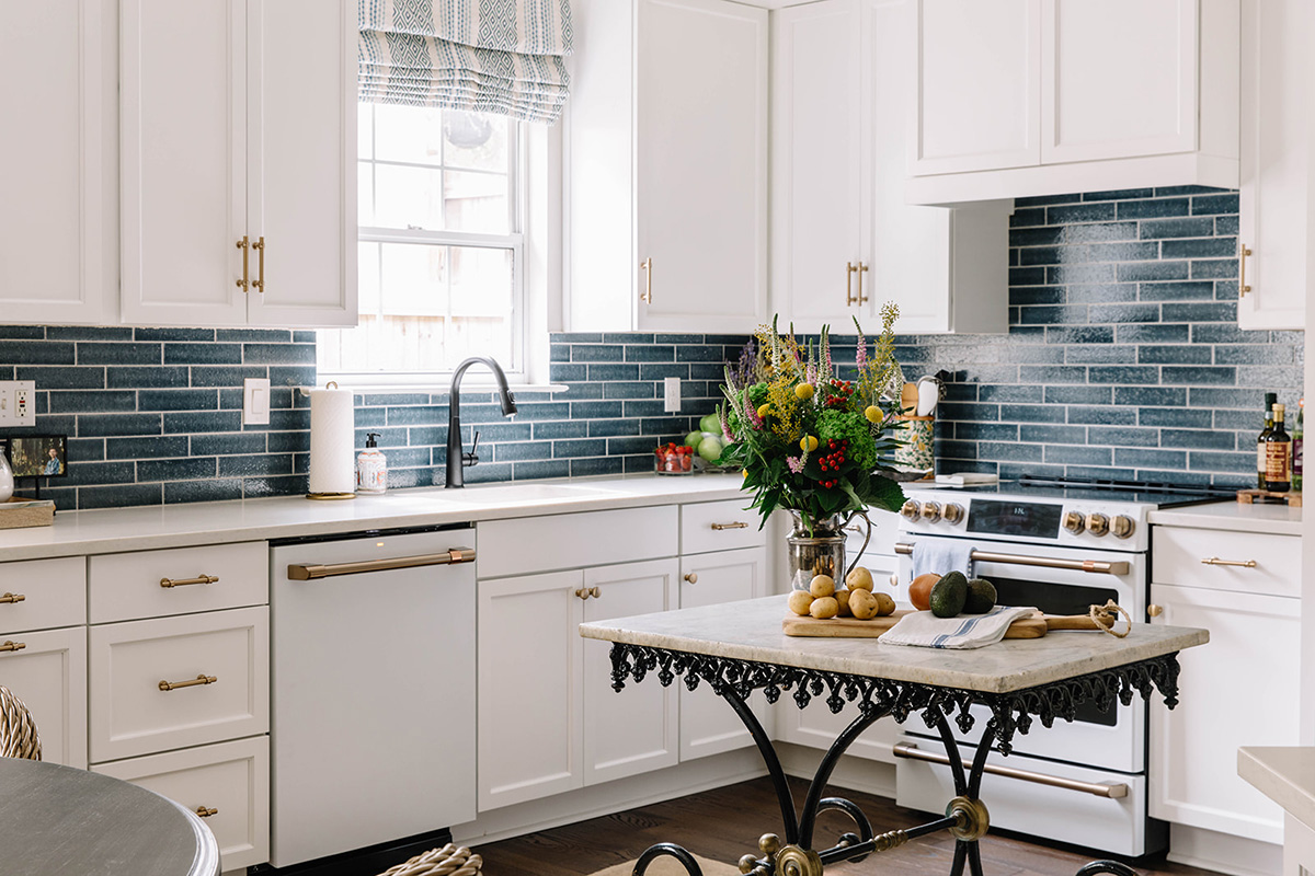
Taylor also took her own advice when she renovated her personal kitchen, updating it with Tesoro’s elongated Cambridge tile in Lagoon.
“Initially, I was going to do black and white mosaics,” she offers. “But when I saw these blue tiles, they didn’t feel like ordinary subway tile. They are a really pretty shade of blue, more cerulean…not quite royal blue or light blue. Since I have an ottoman and some artwork in the adjacent family room that are a similar color, it all comes together nicely. And, because the cabinetry is white, the added color keeps the kitchen from looking too sterile.
“These tiles also have a hand-painted look to them with a bit of an uneven edge,” she continues. “And, even though they have a slight texture, they are super easy to clean. They give me a handmade look, without the additional cost. Those blue tiles have gotten me more praise than anything else I have done in the house!”
Going bold, such as what Taylor did in her kitchen, can be a difficult decision, the designer admits. But she also points out that a backsplash is one of the easiest elements – and usually less expensive compared to countertops and cabinetry – in a kitchen to change. And, when a client might be hesitant about deciding on something that may be outside of their comfort zone, she encourages them to select countertops and cabinetry first.
“There are usually fewer countertops to choose from,” she explains, “so once we land on a countertop and cabinetry, it can be easier to take a client to the tile shop. Backsplashes are typically one of the last elements to get installed, too, so there is normally some time to make decisions.”
When it comes to countertops, Taylor’s clients often appreciate the benefits of quartz.
“I’m a big fan of quartz, for a lot of reasons, including relatively low cost and easy maintenance,” she indicates. “Manufacturers have also done a really good job in recent years of giving us some really good options that look like natural stone.”
As such, the designer selected Corian’s London Sky quartz for the perimeter countertops in her kitchen, complementing it with an antique French pastry table topped with marble for her island.
“The quartz was a really good price point for me,” she
says, “and at the time of the renovation, it was one of the most natural-looking quartz surfaces available.”
Anastasia Harrison, Architect/Creative Director
AHD & Co., Westfield, NJ
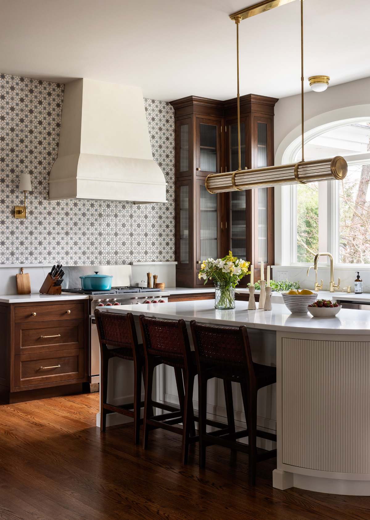
Given their good ‘bones’ and unique character, Anastasia Harrison loves renovating homes from the early 1900s.
“The elements and pieces of those homes are typically quite beautiful, and you just need to lean into them and work with them, as opposed to stripping them,” reports the architect/creative director, AHD & Co., in Westfield, NJ. “Some designers want everything ‘clean,’ but there is so much character to an older home. It’s a style of architecture I truly enjoy working with.”
As such, when selecting materials for those historical projects, she is often guided by materials and design elements that already exist within a home, or are from its time period. For example, in one recent renovation, the kitchen’s dark walnut cabinetry was inspired by existing millwork found elsewhere in the home.
“We found a piece of dark brown dilapidated millwork that needed to be replaced, so that’s why we included the walnut cabinetry…we wanted to bring back some of the historical charm from the original house into the new kitchen,” she explains, adding that the pantry door is original to the house, too.
As well, the designer suggested Fireclay Tile’s 8″x8″ Elephant Star ceramic tile as the accent wall behind the range because its color and pattern reminded her of antique wallpaper and vintage stamped metal ceilings.
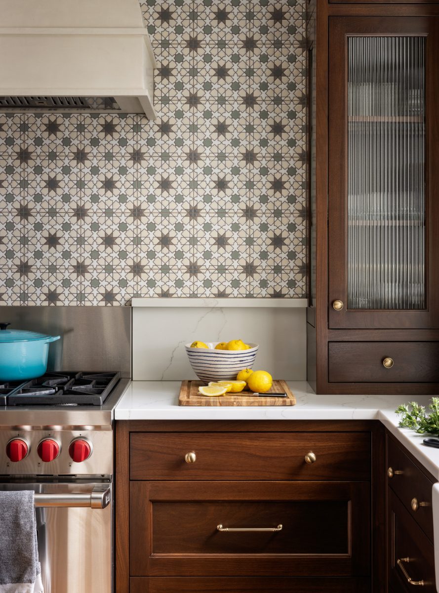
“I knew I wanted something that looked like old wallpaper,” she recalls. “And when I found this tile, it also reminded me of old stamped metal ceilings.
“In general, I love using patterned tile like the one in this kitchen, as well as tile that has interlocking shapes or a lot of texture, like a handmade zellige,” she continues. “For me, a backsplash doesn’t need to be so perfect. A countertop should be smoother, cleaner and more perfect, but a backsplash offers an opportunity to be less perfect. Both finishes, when selected in harmony, can really elevate a design, rather than be strictly a necessary component. They add layers that add texture and beauty.”
While the Elephant Star tile seemed like an ideal selection for this kitchen, Harrison acknowledges that her client initially hesitated on a full commitment until right before it was installed.
“We selected it early on in the design process, but it was expensive so she didn’t fully embrace it until she knew it would fit into her budget,” Harrison says. “In the end, she agreed to it and now she loves it!”
Given her love of all things historic and classic, Harrison is also a fan of marble as a countertop surface, and in some cases as a backsplash as well.
“It’s natural and unpredictable, and nobody else will have anything like it because every slab is unique,” she notes. “Fortunately, there are coatings available now that make marble more durable and stain resistant.”
While many of her clients do choose marble, these homeowners, who have a young child with plans for more, selected a marble-look quartz from Emerstone for the perimeter and island. Harrison added interest by giving the island a rounded edge, which also makes it easier to walk around. As well, she extended the perimeter countertops part way up the wall, capping it with a small ledge.
“The range was an original appliance that my clients wanted to keep,” she explains. “It had a stainless steel back piece that would have disrupted the tile, so we raised the countertop to be in line with the stainless steel and added a ledge for the tile to sit on nicely.”
Monika Merchant, Principal/Founder
Monika Merchant Design Studio, Fort Worth, TX
Practical needn’t necessarily be boring or uninteresting, as demonstrated by the finish selections Monika Merchant suggested for clients who recently built a new-construction home for their family. For example, soapstone serves as the island and perimeter worktop surfaces and inspired decisions made subsequently with regard to the backsplash.
“I often start with countertops because they get so much use,” says the design principal/founder of Monika Merchant Design Studio in Fort Worth, TX. “And, how they are used, and how active a family is, influences the material we use. As a family lake house, there was going to be a lot of different people using this kitchen, so it was really important for my clients to have a countertop that is stain resistant. It is very difficult to stain soapstone, so that was a big plus for the material. It can scratch easily, though, but applying wax and embracing that scratches are part of the patina made them more comfortable with the decision.”
As a natural stone, each slab is also unique, so the designer spent time with her clients perusing several stone yards before ultimately deciding on this relatively dark slab with subtle veining that offers a bit of movement.
“A lot of soapstone can be ashy gray or lean towards green, but this slab is unusually dark black, which is made even darker with wax,” she relates. “That darkness was something that we wanted. At one point in the design process we had considered a light-colored countertop, but there is a lot of light that flows into the space. And, we didn’t want the cold rolled steel ventilation hood to be the only dark element, so it just felt right to have a dark countertop.”
Extending the stone up the wall to serve as part of the backsplash behind the range also eases cleanup associated with cooking. Adding a shallow shelf provides a place to set frequently used ingredients as well as a few décor items.
The stone’s dark hue also contrasts with the 4″x8″ Ann Sacks Idris by Ait Manos zellige tile backsplash that extends from the soapstone shelf to the ceiling.
“I love the dimension of the rectangular tile, which is slightly oversized than what you typically find for zellige,” Merchant indicates. “In this situation, it just works better than a square.
“This particular tile is also a little bit thicker than most zellige tile, which my tile installer was really grateful for,” she continues. “Traditionally there isn’t a trim piece on the ends, so he mitered the edges instead, which can be tricky because zellige tile is actually quite fragile until it is installed.”
Merchant also appreciates the reflective qualities of the tile’s glossy finish, which is complemented by the pair of mirrored pendants above the island.
“There isn’t a window directly in the kitchen, so we wanted something that would add a bit of life to the space,” she explains.
Nadja Pentic, Founder
Knocknock Kitchen and Bath Design, Oakland, CA
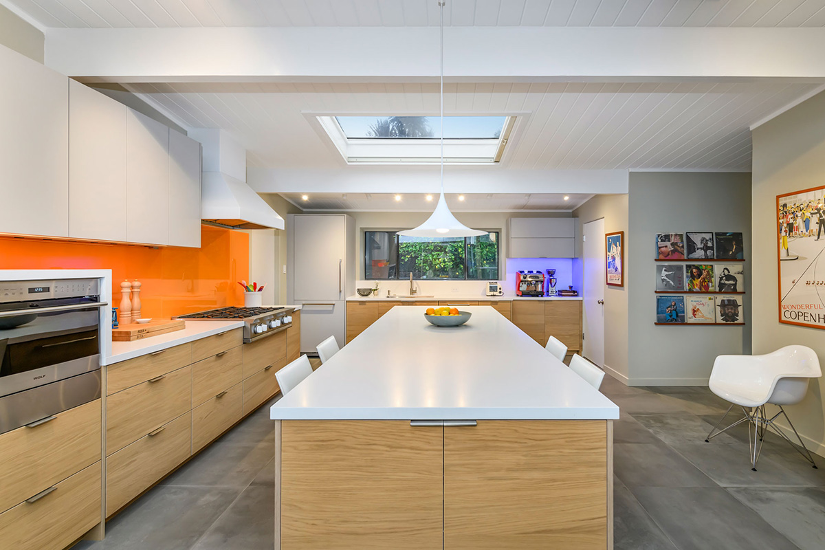
Nadja Pentic appreciates surfaces that are easy to maintain and clean as well as support a modern and contemporary design style. As such, she often finds herself specifying quartz in her design projects.
“For countertops, my favorite material is quartz,” says the founder of Knocknock Kitchen and Bath Design in Oakland, CA. “It’s super durable and easy to maintain. There is also a ton of options in the market, both in styles that look like natural stone as well as solid colors, so I have a lot of choices to work with, whether I’m designing something that is more modern, more transitional or more traditional.”
Oftentimes she will continue the quartz as the backsplash.
“I am more of a modern designer, and this [technique] is very modern looking, as well as very easy to maintain because there is no grout,” she continues. “And, I also think that, in a lot of cases, it makes a kitchen look more expensive and more luxurious because it has this expansive ‘stone’ climbing up the wall.”
Quartz, specifically Cambria’s Smithfield, was the material of choice for the countertops in the recent renovation of the kitchen in a mid-century modern Eichler-designed home, where she used it for the island and perimeter work surfaces as well as for the backsplash along the window wall.
“This particular quartz pattern doesn’t have a lot of movement or veining, which is ideal for these clients,” she notes. “It provides a clean, more uniform look for the home.”
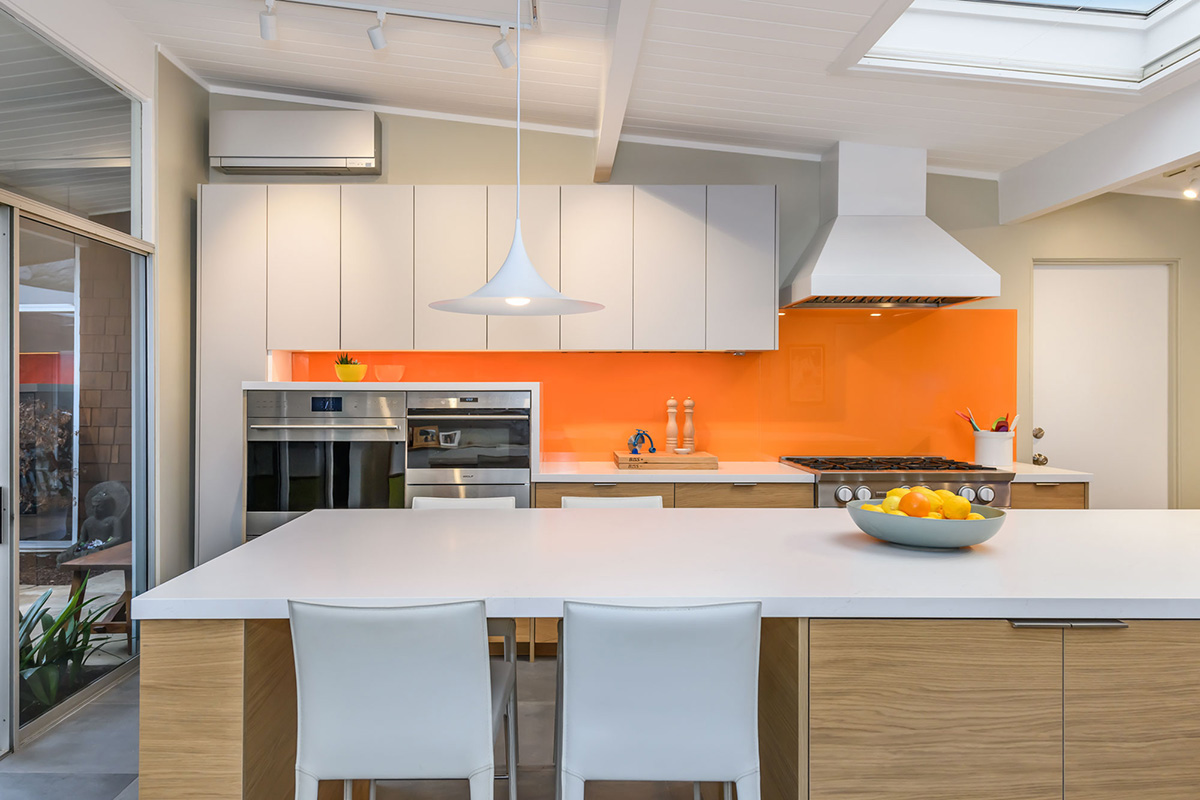
Its monochromatic, ‘quiet’ vibe also allows the more vibrant orange back-painted glass backsplash, sourced from Glashaus, to take center stage. Extending it along an entire wall in the kitchen creates consistency along the wall while also making a statement.
century modern Eichler-designed home, it serves as the island and perimeter work surfaces and the backsplash along the window wall. Its monochromatic, ‘quiet’ vibe allows the more vibrant orange back-painted glass backsplash to take center stage.
“These clients wanted something really bright, happy and light,” she recalls. “One of their inspiration pictures featured an orange backsplash, so I knew they wanted something with color. Since a backsplash is one of the largest surfaces in a kitchen, it’s a great place to add color, or pattern…to tell a story and be really, really creative.”
Glass, with its clean, sleek aesthetic, also supported the design style her clients wanted.
“They were committed to a mid-century modern style,” she remarks. “When you look at the rest of their home, their furniture, etc., everything is very mid-century modern.”
Glass is also one of Pentic’s favorite materials to work with because it, like quartz, is durable and easy to clean. As well, it can be painted virtually any color.
“Glass is amazing in terms of maintenance,” she relates. “Windex is all you really need for cleaning. And it also needs very few seams, which means minimal grout. Another thing I like about glass is its reflectivity. If you have a kitchen, or any area close by, with a lot of windows, the glass will reflect light and the view while adding subtle texture.”